Carpet Colors: How to Pick the Right Hue for Your Home
Choosing a carpet color can feel overwhelming, but it doesn’t have to be. Think of it like picking a paint shade – you want something that feels right in the room and works with the rest of your décor. Below are simple steps to help you decide.
Start with the Room’s Purpose
Every room serves a different function, and the carpet should support that. In high‑traffic areas like the hallway or family room, go for medium to dark shades. They hide dirt and wear better than light colors. For bedrooms or low‑traffic spaces, light neutrals or soft pastels keep the room feeling airy and relaxed.
Match the Existing Palette
Look at the colors you already have – wall paint, furniture, curtains, and accessories. If your walls are a bold blue, a neutral carpet such as beige, gray, or ivory balances the visual weight. When the walls are neutral, you can play with a splash of color in the carpet. A muted green or warm taupe adds interest without clashing.
Another trick is to pull a color from a piece you love – a throw pillow, artwork, or rug. Use that hue as inspiration for the carpet, but keep it muted so it doesn’t dominate the space.
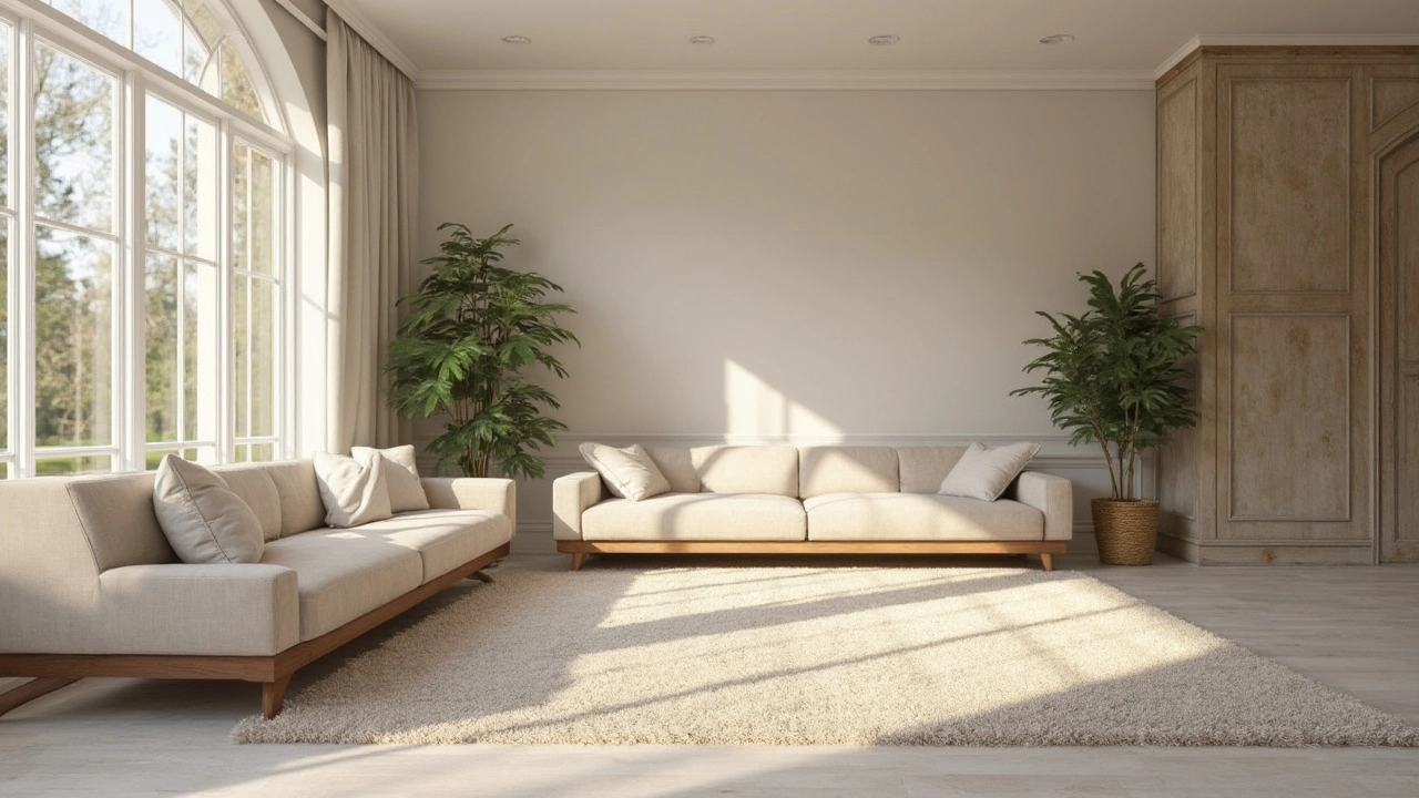
Consider Light and Mood
Natural light changes how a carpet looks. In a sun‑filled room, dark colors stay dark, while light colors can appear washed out. In darker rooms, a light carpet reflects what little light there is and makes the space feel bigger. Test a sample swatch on the floor at different times of day before committing.
If you want a cozy vibe, warm tones like caramel, rust, or soft gold create a snug atmosphere. Cool tones such as pale blue or sage give a fresh, calm feel.
Think About Maintenance
Practicality matters, especially with families or pets. Stains are easier to hide on patterned carpets or those with a mix of colors. If you love a solid color, choose a shade that doesn’t show crumbs or pet hair – think charcoal, navy, or chocolate brown.
When you’re unsure, a subtle pattern can disguise wear while still looking stylish. Geometric or tonal patterns add texture without overwhelming the room.
Mix and Match with Other Floors
If you have hardwood or tiles in the same space, a contrasting carpet can define zones. A dark rug under a kitchen island or a light runner in a hallway separates areas visually and adds comfort underfoot.
Don’t be afraid to layer – a small decorative rug on top of a larger neutral carpet creates depth and lets you switch styles easily.
Final Quick Checklist
- Know the room’s traffic level – dark for busy, light for calm.
- Match or complement existing colors – use a swatch.
- Check how the carpet looks in natural light at different times.
- Pick a shade that hides stains if you have kids or pets.
- Consider patterns to disguise wear and add texture.
With these tips, picking carpet colors becomes a fun part of designing your home instead of a headache. Remember, the right hue can tie a room together, make a space feel larger, and stay looking fresh for years.