Color Psychology: Using Hues to Boost Mood and Style at Home
Ever walk into a room and instantly feel calmer, more energized, or even a bit hungry? That’s color psychology at work. The shades on your walls, pillows, and curtains send signals to your brain, nudging emotions up or down. Knowing the basics lets you choose colors that match the vibe you want, without hiring a designer.
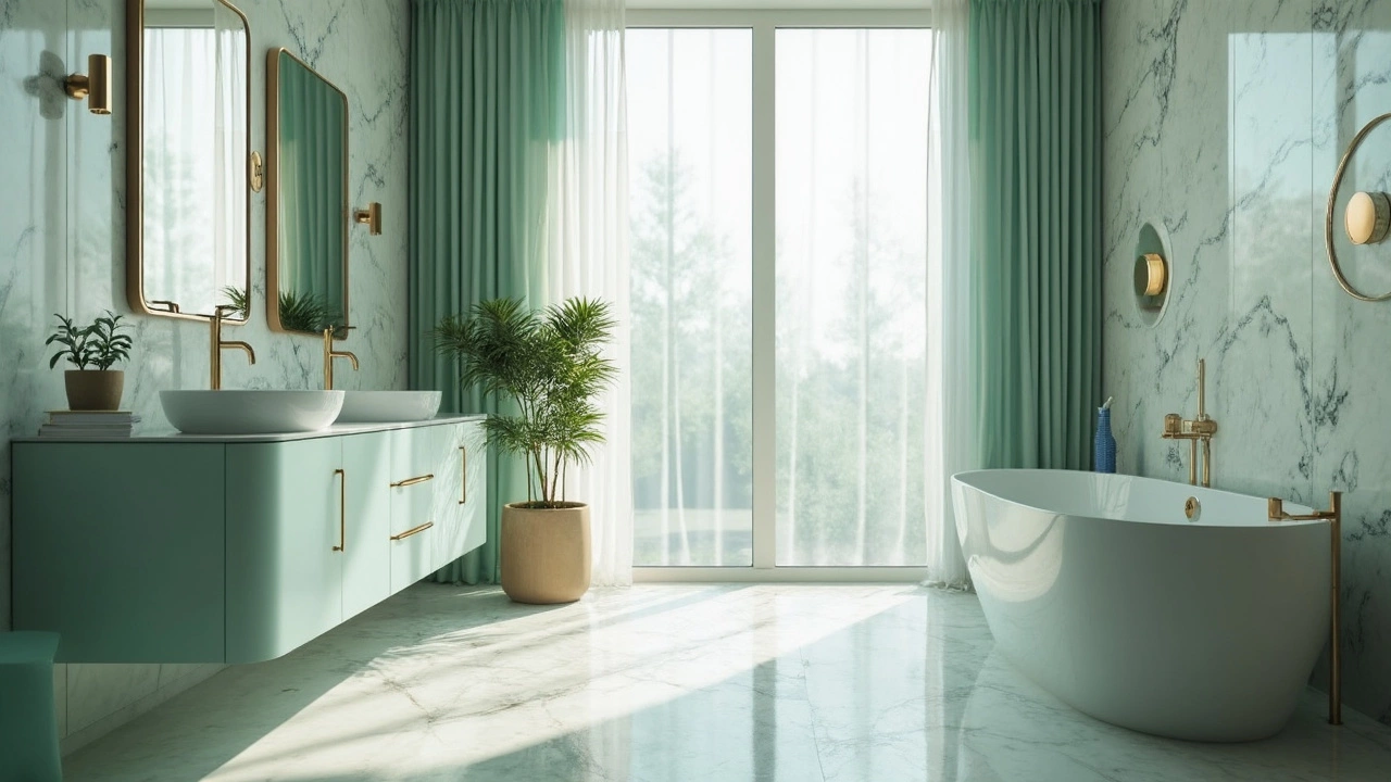
Red, for example, can raise heart rate and spark excitement. It’s great for a dining area where you want conversation to flow, but might be too loud for a bedroom. Blue, on the other hand, lowers stress and helps you unwind. A soft sky‑blue duvet cover or curtains can make a master suite feel like a retreat. Green sits in the middle—refreshing without overwhelming—so it works well in kitchens and living rooms where you spend a lot of time.
Practical Tips for Choosing the Right Hues
Start by deciding the feeling you need in each space. Write it down: "relax," "focus," "cozy," etc. Then match a color family to that feeling. If you need to concentrate in a home office, try a muted teal or cool grey; they encourage focus without the distraction of bright orange. For a cozy lounge, warm neutrals like taupe or soft amber create a snug atmosphere.
Don’t forget lighting. Natural light can soften a bold hue, while dim artificial light can make the same shade feel heavy. Test paint chips at different times of day before committing. If you’re on a budget, swap out accessories first—cushions, throws, or rug runners—before repainting entire walls.
Color Psychology in Action on Our Blog
We’ve written several posts that show color psychology in real homes. The "Best Curtain Colors to Match a Grey Sofa" article walks you through cool and warm curtain options that either calm a modern grey sofa or add a pop of energy. Our "Curtain Trends 2024" guide highlights bold blues and soft greens that are trending because they balance style with mood‑boosting benefits.
Looking for a quick win? Replace a plain white towel set with a deep navy hand‑towel. The contrast adds visual interest and the dark hue can feel more luxurious. Or try a mustard‑yellow pillow on a neutral couch—yellow lifts spirits and makes the seating area feel sunny even on a cloudy day.
Remember, color isn’t a one‑size‑fits‑all rule. Personal preference plays a huge role, so trust what feels right to you. If a bright orange wall makes you smile, go for it. If it feels overwhelming, dial it back with neutral furniture.
Finally, keep the flow in mind. Connecting colors across rooms creates a seamless journey through your home. A hint of teal in the hallway can tie together a blue bedroom and a green kitchen, making the entire house feel cohesive.
By using color psychology deliberately, you turn ordinary rooms into spaces that support how you want to feel. Play with shades, test them out, and watch your home transform into a place that truly matches your mood and style.