Flattering Hues: Easy Color Guides for a Stylish Home
Ever stare at a room and wonder why the colors feel off? Most of the time it’s not the furniture—it’s the hue choice. Picking shades that complement your space can make a room feel bigger, cozier, or more vibrant with minimal effort. Below you’ll find straight‑forward tips you can use right now, plus links to the most popular posts on our site that dive deeper into specific rooms.
Choosing the Right Hue for Your Living Room
The living room is the heart of the home, so start with a neutral base—think soft greys, warm whites, or light beiges. From there, add a splash of color that flatters the base and matches your furniture. For example, if you have a grey sofa, our "Best Curtain Colors to Match a Grey Sofa" article suggests teal, mustard, or dusty pink as eye‑catching options that still feel calm.
When you pick a main wall color, ask yourself: does it make the room feel larger? Light, cool tones reflect more light and can open up a cramped space. Dark, warm tones add intimacy—perfect for a den or media room. Test a paint swatch on a small section of wall and watch it at different times of day before committing.
How to Pair Colors Across Rooms
Consistency doesn’t mean matching every wall. Instead, carry a single accent hue from one room to the next. If you love navy in the kitchen, repeat that navy in the bathroom accessories or the hallway rug. Our "Curtain Trends 2024" post highlights the rise of muted jewel tones—great for tying spaces together without overwhelming the eye.
Use accessories to introduce color without a big commitment. Throw pillows, artwork, and rugs are cheap changes that can instantly upgrade a look. The "Is $400 Too Much for a Rug?" guide breaks down how to evaluate quality versus price, helping you choose a rug that showcases your chosen hue without breaking the bank.
Don’t forget natural light. South‑facing rooms can handle deeper shades because they get plenty of sunshine. North‑facing spaces benefit from lighter, pastel tones to keep them from feeling gloomy. If you’re unsure, start with a soft version of your favorite color and build up if you need more drama.
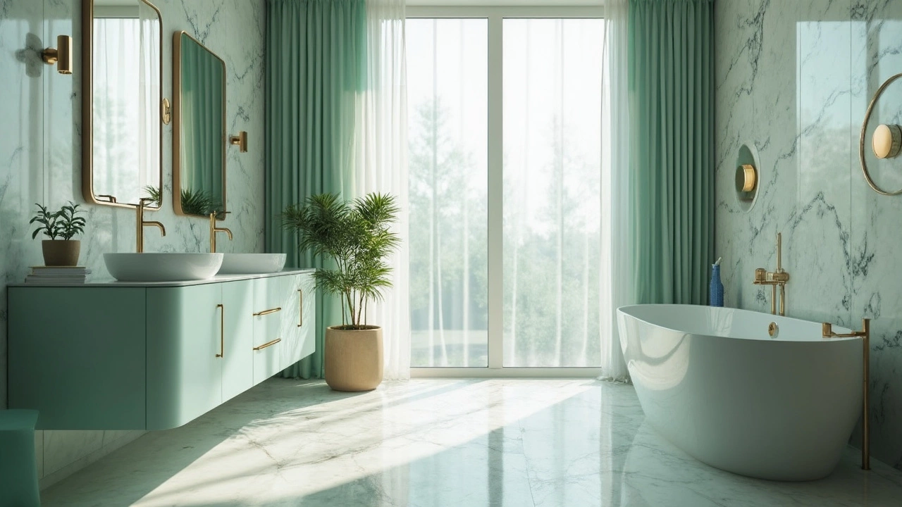
Finally, keep balance in mind. Too many bold colors can clash, while too many neutrals can feel bland. Aim for a 60‑30‑10 rule: 60% neutral base, 30% secondary color, and 10% accent. This framework works whether you’re decorating a bathroom, bedroom, or kitchen, and it aligns with the advice in our "Essential Bathroom Accessories List" article.
Ready to experiment? Grab a paint swatch, pick a favorite accent piece, and use the tips above to create a cohesive look. You’ll be surprised how a single flattering hue can transform the vibe of your whole home.