Do Curtains Need to Match the Sofa? Exploring Design Harmony
 Sep, 12 2024
When it comes to home decor, a question that often pops up is whether the curtains in a room should match the sofa. It's a question rooted in the desire for harmony and balance in a living space, yet the answer remains deeply personal and subjective.
Colors and textures in a room significantly impact the ambiance, making it essential to consider how these elements work together or stand apart. While some people prefer perfectly coordinated colors, others might be drawn to the charm of contrasting tones that bring an eclectic vibe.
In this article, we'll explore the interplay between color coordination, fabric textures, and patterns. You'll discover how to balance these elements to create either a harmonious or boldly unique environment that speaks to individual tastes.
- The Role of Color Coordination
- Balancing Textures and Patterns
- Exploring Contrast and Harmony
- Tips for Personalizing Your Space
The Role of Color Coordination
Color coordination is more than just a design term; it's the art of creating an environment that feels both visually appealing and emotionally comforting. And when it comes to deciding if your curtains should match your sofa, understanding the nuances of color psychology can be a game changer. Colors have a profound effect on our emotions and the way we perceive a space. For instance, a room dominated by soft tones might evoke a sense of calm and tranquility, making it a restful sanctuary after a long day. Meanwhile, vibrant and contrasting colors might inject energy and dynamism, ideal for a lively and vibrant atmosphere. Interestingly, studies have shown that up to 87% of people see color as a critical factor in home design, showcasing its impact on our everyday lives.
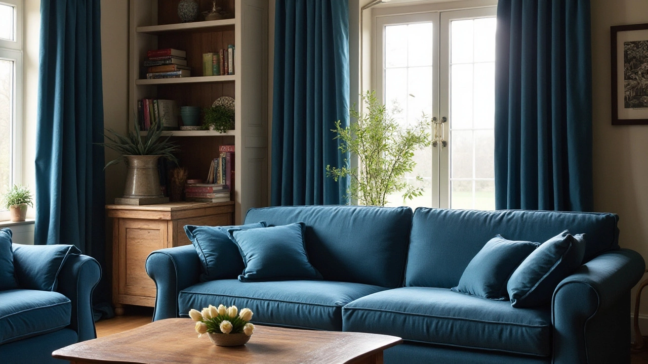
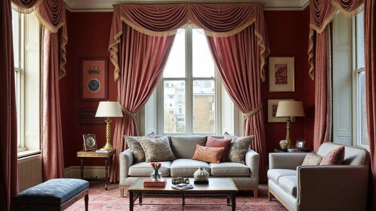
Matching curtains with your sofa can create a sense of flow and unity, offering a more cohesive look to the living space. This strategy often employs the use of monochrome schemes or analogous colors, where shades transition smoothly without clashing. Consider the use of a similar palette — like blues or earth tones — when aiming for this cohesive effect. But it’s not just about replicating colors; variations in shades and hues can add interest while still maintaining coordination. To this end, different hues of the same color can offer depth and dimension without veering into monotony. Designers often use this technique to ensure that while elements match, they don’t flatten the visual appeal of the space.
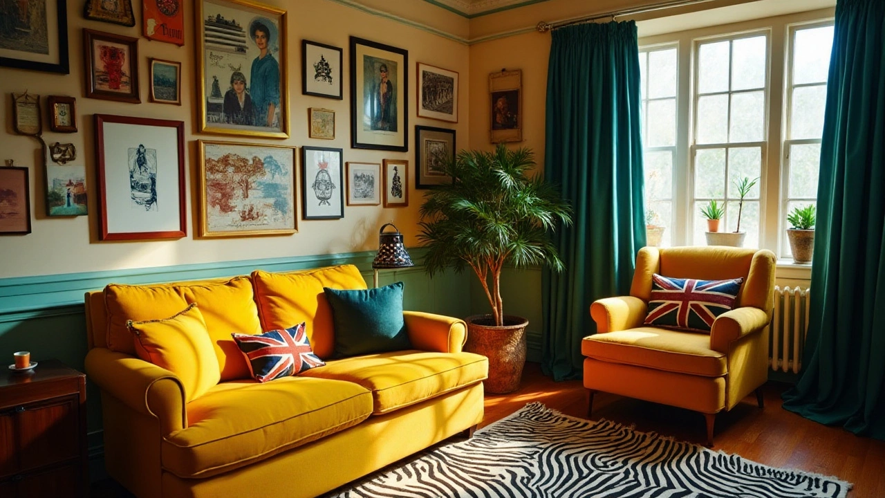
In contrast, some decorators suggest looking at complementary colors to create what's known as a 'pop' effect, where the curtains might offer a startling but delightful contrast to the sofa color. This approach taps into the vibrancy of color wheel oppositions, an idea popularized by artists like Vincent van Gogh. Van Gogh himself noted, “If one could marry two complementary colors, they complement and reinforce each other like a man and woman,” highlighting the natural balance achieved when done correctly. Bold contrasts can draw attention to specific areas in your living room, possibly making either your sofa or curtains the focal point of the room.
When striving for color harmony, considering the size and function of your room can also provide guidance. Larger rooms might comfortably handle bolder contrasts without feeling cramped, while smaller spaces might benefit more from a uniform look to avoid feeling crowded. Additionally, aligning your choice with natural or existing architectural features, like a fireplace or large windows, can lend authenticity to your space. Many homeowners find that coordinating with these permanent features ensures a natural and sustainable aesthetic, enhancing the home’s intrinsic beauty rather than overshadowing it.
It's essential to remember that color coordination in home decor isn't a one-size-fits-all journey. Your choices should mirror your personal preferences and the mood you wish to evoke. While embracing current trends might be tempting, don’t be swayed if they don’t resonate with your vision. After all, the best homes are those that reflect their owners’ unique styles and stories. Whether you lean towards matching or contrasting curtains with your sofa, what's most important is that your space feels authentic to you.
Balancing Textures and Patterns
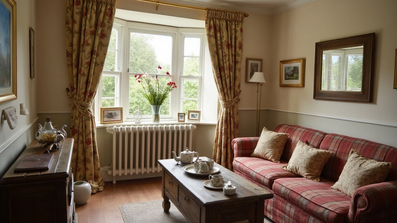
In the world of home decor, one of the essential elements often overlooked is how textures and patterns can bring life to a room. At first glance, it might seem that these aspects are of less importance compared to colors. But in reality, the feeling and depth these elements add can completely transform a room's atmosphere. A sofa might have a smooth leather finish or a plush velvety touch, while curtains could offer light, breezy linen or rich brocade styles. Combining these textures smartly can create a harmonious or visually striking environment, depending on the desired effect.
The way a pattern interacts with textures can either emphasize a certain mood or clash entirely. Stripes, florals, geometrics, and solids each carry distinct vibes. Imagine pairing a bold geometric print on a sofa with delicate lace curtains. Such an arrangement can create an inviting contrast while maintaining elegance. On the other hand, attempting to pair heavily detailed brocade curtains with an ornate, patterned sofa might overwhelm a room, leaving it feeling chaotic rather than serene.
Creating a balanced room isn't only about finding contrast. It's also about achieving a seamless flow. For instance, combining a neutral color scheme with varied textures, such as a shaggy throw on a sleeker sofa, accompanied by cotton or jute curtains, can add interest without overbearing the senses. The trick lies in letting each element shine individually while collectively contributing to an overarching theme.
According to renowned interior designer Nate Berkus, "Your home should tell the story of who you are, and be a collection of what you love." This perspective highlights the importance of personal preference over strict matching rules. A room should resonate personally, making the choice of patterns and textures feel innately right to those who inhabit the space. Ultimately, textures and patterns are less about strict rules and more about playing around to find what feels and looks best.
To further understand the impact of textures and patterns, consider a scenario with a monocolor scheme. Suppose a room uses varying shades of beige. Pairing rich textures like a woven jute rug, a tweed sofa, and silk curtains can add layers of depth often lost in a single-hued palette. Each material offers a unique light reflection and tactile experience, energizing the space beyond the mere color spectrum.
Incorporating different patterns doesn't mean chaos if executed thoughtfully. Consider a rule of threes: select a large, medium, and small pattern, ensuring they share a common color tone or family. Combining a large floral pattern, a medium stripes, and a small polka dot on various elements can work surprisingly well, introducing a dynamic interplay without overwhelming the senses.
Exploring Contrast and Harmony
Contrast and harmony are two sides of the same coin when it comes to interior design. Understanding how these elements play off one another can transform a room from ordinary to extraordinary. The key lies in balancing opposing colors, textures, and patterns to create a dynamic yet cohesive environment. Consider colors nestled on opposite sides of the color wheel. Pairing a neutral-toned sofa with vibrant, colorful curtains can give a room a lively feel, while maintaining a sense of order through the repetition of texture. It's about finding the right balance where neither element overtakes the other, yet both stand out.
There's an allure in creating contrast; it invites the eyes to dance around the room, soaking in each element's uniqueness. When done right, bold contrasts can add energy and personality to a space. One captivating approach is to introduce a bold pattern in the curtains, while keeping the sofa solid in color. This makes the curtains an accent piece, drawing attention without overwhelming the senses. On the other hand, harmony is achieved when elements in the room draw from the same palette or share complementary patterns, promoting tranquility and unity.
The Science of Color
Color theory plays a significant role in achieving the perfect balance. Studies show that using complementary colors in home decor creates a visual interest that is pleasing to the eye. By understanding how different colors work together, you can manipulate the mood of a room. For example, blue and orange are complementary colors that offer vibrant contrast yet derive balance when used thoughtfully. A room with a blue sofa could benefit from orange-toned curtains to bring a splash of warmth."The whole point of color in home design is to create an emotion and a feeling," says renowned interior designer, Jonathan Adler. "By playing with contrasts, you tell a story in shades."
Using different textures is another creative avenue for mixing contrast with harmony. Consider a plush velvet sofa paired against sleek, minimalist cotton curtains. The difference in texture invites you to engage with each piece on a sensory level, while still maintaining an overarching theme, like earthy tones or modern elegance. The contrast here is in the tactile experience, which can be just as impactful as color contrast.
In the end, whether you opt for harmonious coordination or daring contrast, the choice reflects your personal style and the story you wish to tell in your living space. Remember, there are no strict rules, only guidelines. A curated mix of colors, textures, and patterns can surely bring out the desired atmosphere. Whether soothing harmony or eye-catching contrast, it is all about how each element adds to the overall composition of your home.
Useful Data for Decisions
Let's look at preferences:| Style | Preference Percentage |
|---|---|
| Contrast | 45% |
| Harmony | 55% |
Tips for Personalizing Your Space
Personalizing your living space can be a rewarding journey, allowing you to express your unique taste and style. When it comes to the harmony between curtains and the sofa, embracing uniqueness is key. A great starting point is identifying a color scheme that resonates with your personality and meets your emotional needs. Often, interior designers suggest starting with a color wheel to choose complementary or analogous colors. This creates visually appealing combinations without being overwhelming. Suppose your sofa is in a bold color. In that case, you might opt for neutral or muted curtains to provide a calming counterbalance, or vice versa.
Textures and patterns also play a significant role in personalization. Mixing varied textiles like velvet, cotton, or linen can add depth and interest to your space. A plain sofa can become an eye-catching feature when paired with patterned curtains, or a patterned sofa can gain sophistication with plain drapes. Don't shy away from playful contrasts—mix a botanical curtain print with a geometric cushion, for instance. According to interior design expert, Jane Smith, "A room should never allow the eye to settle in one place. It should smile at you and create fantasy." This sentiment underscores the joy and creativity you can pour into your decor.
The placement and style of your curtains can also be transformative. Floor-to-ceiling drapes can make a room feel grand and open, which is ideal for creating an inviting atmosphere. You might also consider playful layering, for example, using sheer curtains beneath heavier ones. This not only adds elegance but gives you the flexibility to control light and privacy throughout the day.
To add a personal touch, gather inspiration from cultures or styles that you are passionate about. If you admire minimalist Scandinavian design, incorporate light fabrics in whites and grays, reflecting simplicity and comfort. Alternatively, if bohemian charm attracts you, go for rich textiles and earthy tones peppered with unexpected prints. To draw insight from respected studies, according to the American Home Furnishings Alliance, 65% of homeowners value pieces in their space that tell a story or have personal significance. So when choosing your sofa and curtains, consider their meaning to you, opting for items that spark happiness and memories.