The Most Relaxing Color for Curtains: A Guide to Calm Interiors
 Aug, 6 2026
Find Your Perfect Relaxing Curtain Color
Select your window direction and desired vibe to get a personalized recommendation for creating a calm sanctuary.
Ever walk into a room and feel your shoulders drop an inch? That’s not magic. It’s color psychology at work, specifically through the massive canvas of your window treatments. When you’re trying to create a sanctuary in your home, the fabric hanging by your windows plays a bigger role than you might think. They frame your view, control your light, and set the emotional tone for the entire space.
If you are asking what the most relaxing color for curtains is, the answer isn’t just one shade. It depends on the light in your room and the specific kind of calm you want to achieve. However, if we had to pick a winner that works in almost every scenario, it would be a soft, warm neutral. But let’s look closer at why certain hues help us unwind while others keep our brains on high alert.
Why Neutrals Are the Ultimate Chill Zone
When people talk about relaxation, they usually mean low stimulation. Your brain processes complex patterns and bright contrasts as potential threats or things that require attention. To relax, you need visual silence. This is where neutral tones come in. They don’t scream for attention. They sit back and let the rest of the room breathe.
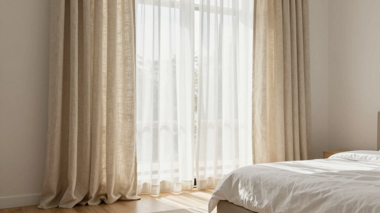
The best neutral for relaxation isn’t stark white, which can feel clinical and harsh under artificial light. Instead, look for soft beige, cream, or off-white. These shades mimic natural materials like linen, cotton, and sand. They provide warmth without intensity. In a bedroom, these curtains act as a gentle filter for daylight, creating a diffused glow that signals to your body that it’s time to slow down. They pair effortlessly with almost any bedding or wall color, making them a safe bet if you plan to redecorate later.
- Cream: Adds warmth and feels inviting, perfect for north-facing rooms that lack direct sunlight.
- Soft Beige: Grounds the space with an earthy vibe, reducing visual clutter.
- Off-White: Keeps the room airy but avoids the sterile feel of pure white.
The Power of Blue for Deep Rest
If neutrals are too plain for your taste, blue is the undisputed champion of relaxation. Studies in environmental psychology consistently show that blue lowers heart rate and blood pressure. It’s no coincidence that the sky and the ocean-the two most universally calming sights on Earth-are blue. Using blue curtains brings that outdoor tranquility inside.
However, not all blues are created equal. Bright royal blue or electric cobalt can be energizing rather than relaxing. For a true chill effect, you want muted, dusty, or pastel shades. Think sky blue, powder blue, or a deeper slate blue for evening ambiance. These colors recede visually, making small rooms feel larger and more open, which reduces feelings of confinement and stress. If you have a busy life and come home to a chaotic mind, a soft blue curtain acts as a visual pause button.
Green: Bringing Nature Indoors
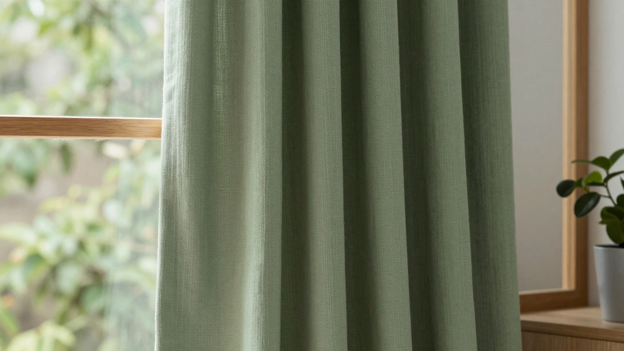
There’s a reason biophilic design-connecting people to nature-is trending so hard. Humans are wired to find greenery soothing. Sage green or olive curtains tap into this instinct without looking like a forest. Green is the easiest color for the human eye to process because it sits right in the middle of the visible spectrum. This means less eye strain and more comfort.
Sage green is particularly effective because it’s desaturated. It doesn’t pop; it blends. It works beautifully with wood tones, plants, and natural fibers. If you spend a lot of time working from home, sage green curtains can reduce digital eye fatigue by providing a softer background contrast than white walls. It’s a sophisticated choice that feels both modern and timeless, offering a quiet elegance that promotes mental clarity.
Gray: The Modern Sanctuary
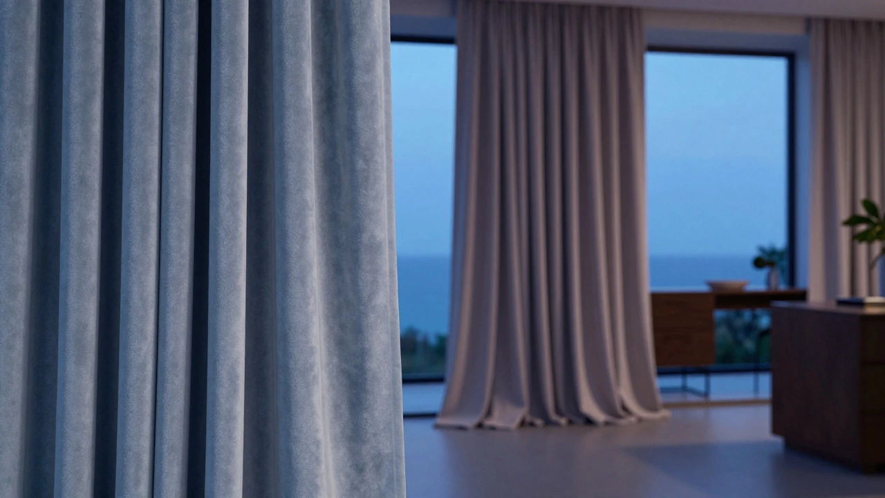
Gray has been a staple in interior design for years, but its reputation for being "cold" is outdated when you choose the right undertone. Warm grays, often called greige (gray-beige), offer a sleek, modern backdrop that feels incredibly stable. Stability is a key component of relaxation. When your environment feels grounded and predictable, your nervous system calms down.
Light gray curtains reflect light softly, maintaining brightness while adding depth. They are excellent for living rooms where you want a relaxed but put-together look. Just avoid cool, blue-based grays if your room gets little natural light, as they can feel cavernous. Stick to warmer, taupe-inflected grays to keep the atmosphere cozy and welcoming. Gray also hides dust and wear better than white, meaning less cleaning stress for you.
How Light Changes the Game
You can pick the perfect relaxing color, but if the lighting is wrong, it won’t work. The direction your windows face changes how colors appear throughout the day. This is crucial when selecting window treatments.
| Window Direction | Light Quality | Best Relaxing Colors |
|---|---|---|
| North-Facing | Cool, indirect, consistent | Warm beiges, creams, soft yellows to add heat |
| South-Facing | Bright, warm, intense | Cool blues, sages, and whites to balance heat |
| East-Facing | Bright morning sun, dim afternoon | Soft pastels, light grays, lavender |
| West-Facing | Harsh afternoon/evening sun | Deeper greens, navy, or thermal-lined neutrals |
For example, a north-facing room can make even warm beige look dull. You might need to go slightly brighter or add texture to keep it from feeling flat. Conversely, a south-facing room can handle cooler tones like sage or light blue because the abundant sunlight warms them up naturally. Always test samples in your actual room before committing. Hold the fabric up against the wall at different times of day to see how the light shifts the hue.
Fabric Matters as Much as Color
Color is only half the equation. Texture influences how we perceive a space psychologically. A shiny, synthetic satin curtain reflects light sharply, creating glare and visual noise. This is the opposite of relaxing. Instead, opt for matte fabrics like linen, cotton, or velvet.
Linen is the gold standard for relaxation. Its natural irregularities and soft drape create a sense of ease and imperfection that feels human and comforting. Velvet adds weight and sound absorption, which can make a room feel quieter and more intimate. The thickness of the fabric also matters. Sheer curtains allow light to filter through gently, while blackout curtains provide total darkness, which is essential for deep sleep. Consider layering: a sheer inner curtain for daytime privacy and light diffusion, paired with a heavier, colored outer curtain for nighttime relaxation.
Colors to Avoid for a Calm Space
Knowing what to avoid is just as important as knowing what to choose. High-energy colors trigger alertness. Red increases heart rate and appetite, making it great for dining rooms but terrible for bedrooms or meditation spaces. Orange is stimulating and social, often used in kitchens or playrooms. Yellow, while cheerful, can be overstimulating in large doses, especially bright lemon shades.
Even dark colors like black or charcoal can feel oppressive if not balanced correctly. While some people find dark moody rooms cozy, for many, they feel cave-like and heavy. If you love dark tones, limit them to accents rather than full-wall coverage via curtains. Stick to lighter, airier shades for the main window treatments to maintain a sense of openness and peace.
Final Thoughts on Choosing Your Shade
Creating a relaxing space is personal. What calms one person might bore another. Start with the emotion you want to feel. Do you want serene and airy? Go with soft beige or white. Do you want grounded and natural? Choose sage green. Do you want deep rest and tranquility? Pick a dusty blue. Remember that your curtains are a major visual element. Treat them with the same care as your sofa or bedspread. By choosing a color that aligns with your psychological needs and your room’s natural light, you transform your windows from mere openings into portals of peace.
What is the most relaxing color for bedroom curtains?
The most relaxing colors for bedroom curtains are soft neutrals like cream, beige, and off-white, as well as muted blues and sage greens. These shades lower visual stimulation and promote a sense of calm, aiding in better sleep quality.
Do black-out curtains affect relaxation?
Yes, significantly. Blackout curtains block external light pollution, which helps regulate melatonin production for deeper sleep. Even if the fabric is a relaxing color, the ability to create total darkness enhances the overall restful atmosphere of the room.
Can patterned curtains be relaxing?
Patterns can be relaxing if they are subtle and low-contrast. Large, bold geometric prints or busy florals can increase cognitive load. Opt for textured solids or very faint, tonal patterns in calming colors like sage or blue to maintain a serene vibe.
What curtain color makes a small room feel bigger and calmer?
Light colors like white, cream, or pale gray make small rooms feel larger and airier. Hanging the curtains higher and wider than the window frame further enhances this effect, drawing the eye upward and creating a sense of spaciousness.
Is beige considered boring for curtains?
Not if you choose the right texture. Beige can feel warm and inviting, especially in linen or velvet. It serves as a versatile backdrop that allows other decor elements to shine without competing for attention, which contributes to a relaxed environment.