What Color Should You Avoid in a Bathroom? The Hidden Psychology of Bathroom Palettes
 Dec, 8 2025
Ever walked into a bathroom and immediately felt off-not because it was dirty, but because of the color? You know the one. That sickly greenish-gray that makes your face look like it’s been underwater for too long. Or the fluorescent pink that screams 1987 and refuses to let go. Color in the bathroom isn’t just about aesthetics. It’s about how you feel every morning when you step in, and every night when you wind down. And some colors? They just don’t belong.
Why Bathroom Color Matters More Than You Think
Bathrooms are small. They don’t have the luxury of space to hide bad choices. A wrong color doesn’t just look odd-it affects your mood, your sense of cleanliness, and even how long you want to stay inside. Unlike a living room where you might change the vibe with throws and lamps, a bathroom’s color is permanent. Paint doesn’t peel off when you get tired of it. Tiles don’t swap out easily. So choosing the wrong shade isn’t just a style misstep-it’s a long-term commitment to discomfort.
Studies in environmental psychology show that colors influence heart rate, cortisol levels, and even perceived temperature. In a 2023 study by the Journal of Environmental Design, participants exposed to cool tones like soft blues and muted grays reported feeling 27% more relaxed after five minutes in the space. But those in rooms with warm reds, neon yellows, or muddy browns? They felt tense, even when the room was spotless.
The One Color You Should Never Use in a Bathroom
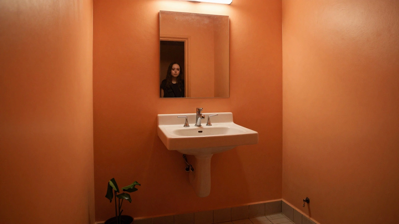
If you’re looking for the single worst color to put in a bathroom, it’s orange. Not the warm, friendly tangerine you see on a fruit bowl. Not the earthy terracotta that works in a kitchen. We’re talking about that flat, outdated, wall-to-wall orange-like the kind that was popular in 1995 bathrooms with matching avocado fixtures.
Why orange? Because it’s the color your brain associates with energy, urgency, and heat. It raises your blood pressure. It makes you feel like you need to be doing something-running, shouting, cleaning. But a bathroom is a place to slow down. To breathe. To wash away the day. Orange fights that. It doesn’t calm. It doesn’t cleanse. It agitates.
And it’s worse than you think. Orange reflects light in a way that makes skin tones look sallow. It casts a yellow-orange glow on your face in the mirror. You’ll think you need more makeup. You’ll think you look tired. You’ll think you need a shower-again. And that’s not even the worst part.
Orange is hard to fix. You can’t hide it with towels. You can’t soften it with plants. You can’t balance it with white accessories. It dominates. It doesn’t blend. It’s the color that sticks to your memory long after you’ve left the room.
Other Colors That Belong in the Trash Bin
Orange isn’t alone. There are a few other colors that should never touch bathroom walls-or tiles, or cabinets, or even your shower curtain.
- Neon green-it looks like a chemical spill. Even in small doses, it creates visual noise. It’s the color of caution tape, not calm.
- Dark purple-deep plum or eggplant might work in a bedroom, but in a bathroom? It makes the space feel smaller, dingy, and claustrophobic. It absorbs light instead of reflecting it.
- Hot pink-yes, it’s bold. But it’s also exhausting. After five minutes under that glare, your eyes start to hurt. And it ages poorly. It looks cheap, not chic.
- Beige with yellow undertones-this one’s sneaky. It looks neutral until you’re standing under the light. Then it turns your skin gray. It’s the color of old wallpaper in a motel bathroom you’d avoid.
These colors don’t just look bad-they make you feel bad. And in a space meant for self-care, that’s unacceptable.
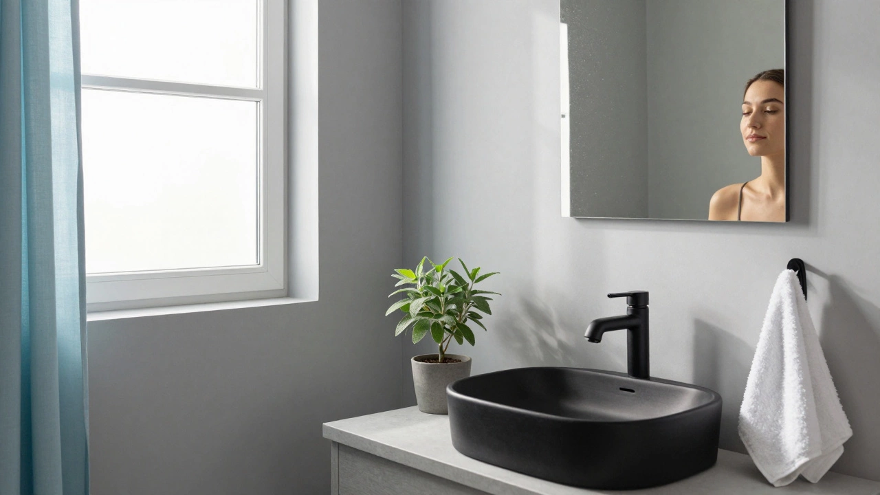
What Colors Actually Work in a Bathroom
So if orange, neon green, and hot pink are out, what’s left?
Start with what nature does best: soft, muted tones that mimic water, stone, and sky.
- Soft gray-the most popular choice for a reason. It’s calming, timeless, and pairs with everything from brass fixtures to white towels.
- Light blue-think ocean mist, not pool water. It lowers stress and feels clean without being sterile.
- Warm white-not stark white. A hint of cream or oat makes the space feel inviting, not clinical.
- Earthy green-muted sage or moss. It brings in nature without the drama of neon.
- Deep navy-yes, dark. But only if you have good lighting. It’s luxurious, deep, and surprisingly calming when paired with gold or matte black fixtures.
These colors don’t shout. They whisper. And in a bathroom, that’s exactly what you want.
How to Test a Color Before You Commit
Painting a whole bathroom is expensive. You don’t want to regret it in six months.
Here’s how to test properly:
- Buy a small sample pot-don’t skip this. Full cans are a trap.
- Paint a large square (at least 2x2 feet) on three different walls.
- Observe it at different times: morning light, noon sun, evening lamp.
- Stand in front of the mirror in that light. Look at your face. Does it look healthy? Or washed out?
- Live with it for three days. Don’t rush. If you still feel uneasy after 72 hours, it’s not the right color.
Some people swear by holding paint chips up to their skin. If the color makes your complexion look dull or sallow, walk away. Your bathroom should make you look better, not worse.
What About Bathroom Accessories?
Color doesn’t stop at the walls. Your towels, rugs, soap dispensers, and even toilet paper holders matter.
If your walls are a soft gray, avoid orange towels. They’ll look like a mistake. Stick to whites, creams, or muted blues. If your tiles are white, don’t pick a hot pink shower curtain. It’ll dominate the space and make the whole room feel chaotic.
Accessories should support the color scheme, not fight it. Think of them as accents-not the main event. A single navy towel on a white shelf? Elegant. A neon green bath mat? A disaster.
The Bottom Line
Your bathroom isn’t a canvas for your boldest design experiment. It’s a sanctuary. And like any sanctuary, it needs peace, not noise.
Orange? Avoid it. Neon? Skip it. Dark purple? Too heavy. Beige with yellow tones? Too tired.
Stick to colors that feel like a quiet breath. Colors that make you feel clean, calm, and a little more like yourself. That’s not just good design. That’s good living.