Curtains vs. Furniture: Should They Be Lighter or Darker?
 May, 24 2026
Curtain vs. Furniture Style Guide
Not sure if your curtains should be lighter or darker than your furniture? Use this guide to find the perfect balance for your room's size, style, and function.
You’ve just bought that perfect sofa. It’s comfortable, stylish, and fits your budget. But now you’re staring at the bare windows, wondering if your new curtains should match it, contrast with it, or disappear entirely into the background. The question "Should curtains be lighter or darker than furniture?" is one of the most common dilemmas in interior design. There is no single rule that applies to every room, but there are proven strategies that can make your space look intentional rather than accidental.
Getting this balance right changes how people experience your home. Lighter curtains can make a small room feel airy and expansive, while darker drapes add drama and coziness. Your choice depends on the size of your room, the amount of natural light you get, and the mood you want to create. Let’s break down the options so you can decide what works for your specific situation.
The Case for Lighter Curtains
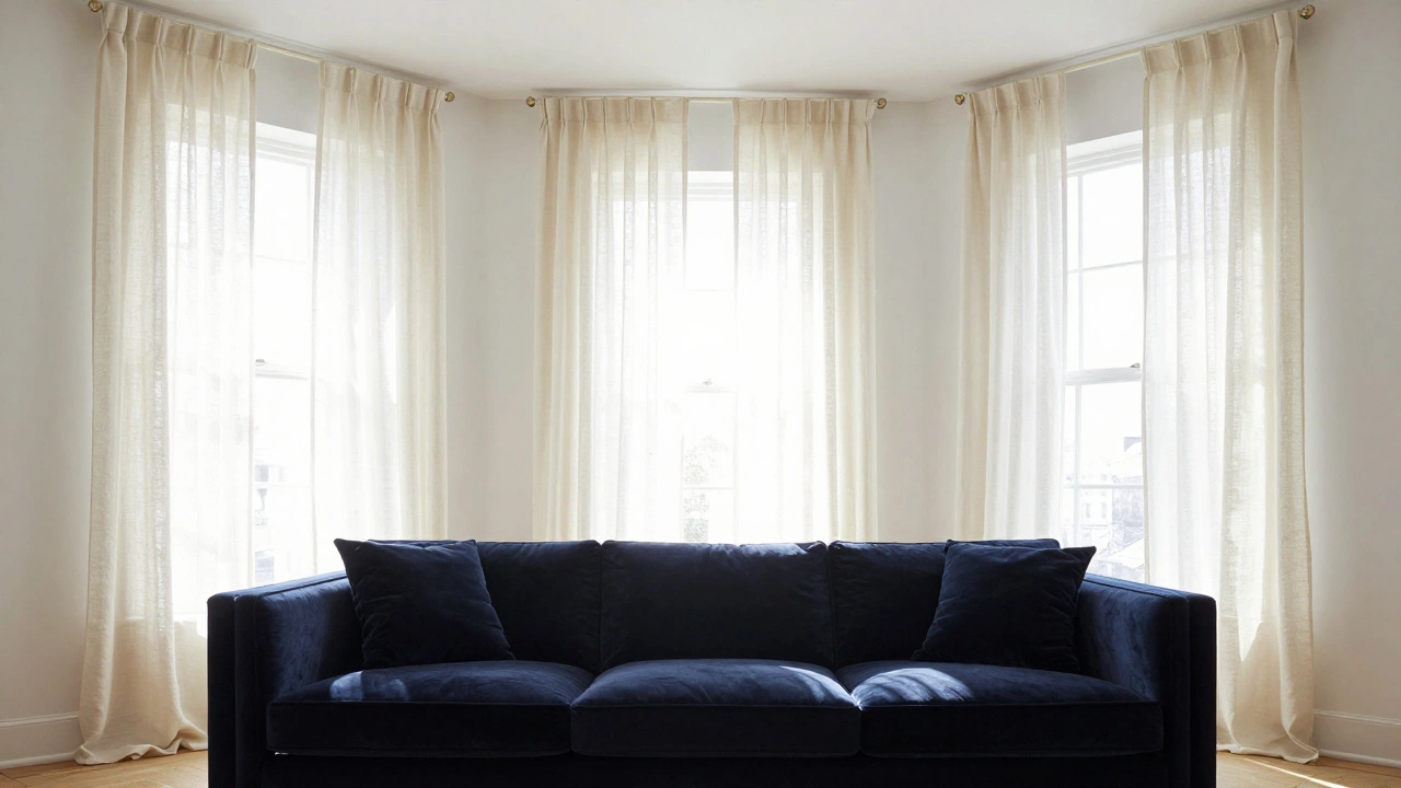
Choosing curtains that are lighter than your furniture is often the safest bet, especially if you are working with a smaller space or limited natural light. When you hang pale shades-think whites, creams, soft grays, or pastels-against darker furniture like navy sofas or charcoal armchairs, you create a sense of depth. The eye is drawn to the contrast, which prevents the room from feeling heavy or cluttered.
This approach is particularly effective in rooms where you want the architecture or the view outside to take center stage. Light fabrics allow more sunlight to filter through, brightening the entire space. If you have dark hardwood floors or bold artwork, keeping the window treatments neutral ensures they don’t compete for attention. It’s a subtle way to frame the room without overwhelming it.
- Brightens small rooms: Reflects light to make spaces feel larger.
- Creates versatility: Neutral tones work with almost any furniture style.
- Emphasizes focal points: Draws attention to art, views, or statement furniture pieces.
The Power of Darker Curtains
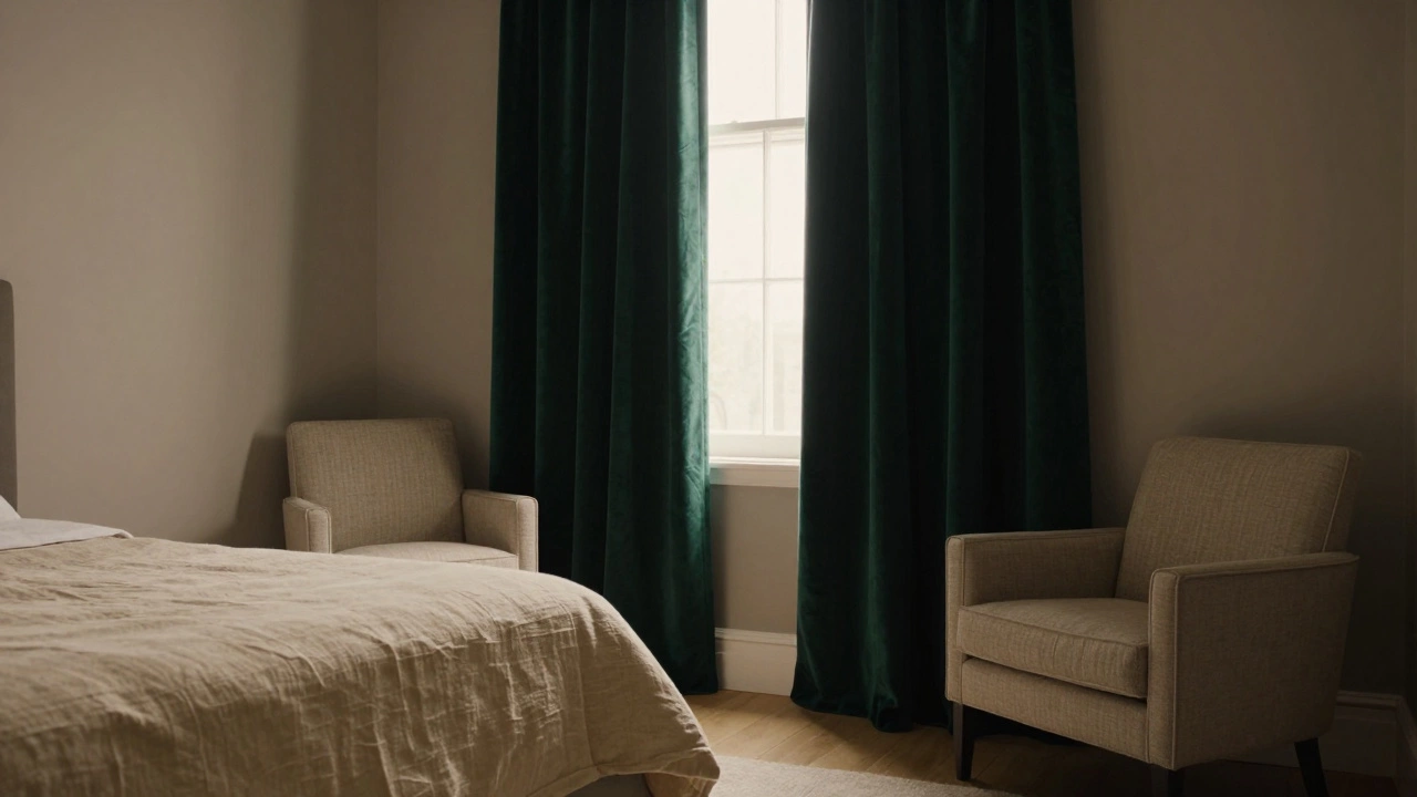
On the flip side, going darker than your furniture can transform a room into a cozy sanctuary. This technique works beautifully in large, open-plan living areas or bedrooms where you want to block out light and create intimacy. Imagine a light beige linen sofa paired with deep emerald green or midnight blue velvet curtains. The result is sophisticated and grounding.
Darker curtains also serve a practical purpose. They hide dust and stains better than light fabrics, which is a huge plus for high-traffic areas or homes with pets and kids. Additionally, thicker, darker fabrics often provide better insulation and soundproofing. If you live in a noisy city apartment or struggle with temperature fluctuations, heavy drapes in a tone deeper than your upholstery can help regulate the environment while adding texture and warmth.
- Adds drama and elegance: Creates a rich, layered look.
- Improves privacy and insulation: Blocks light and noise effectively.
- Hides wear and tear: More forgiving of dirt and spills.
Matching the Wall Color: The Invisible Frame
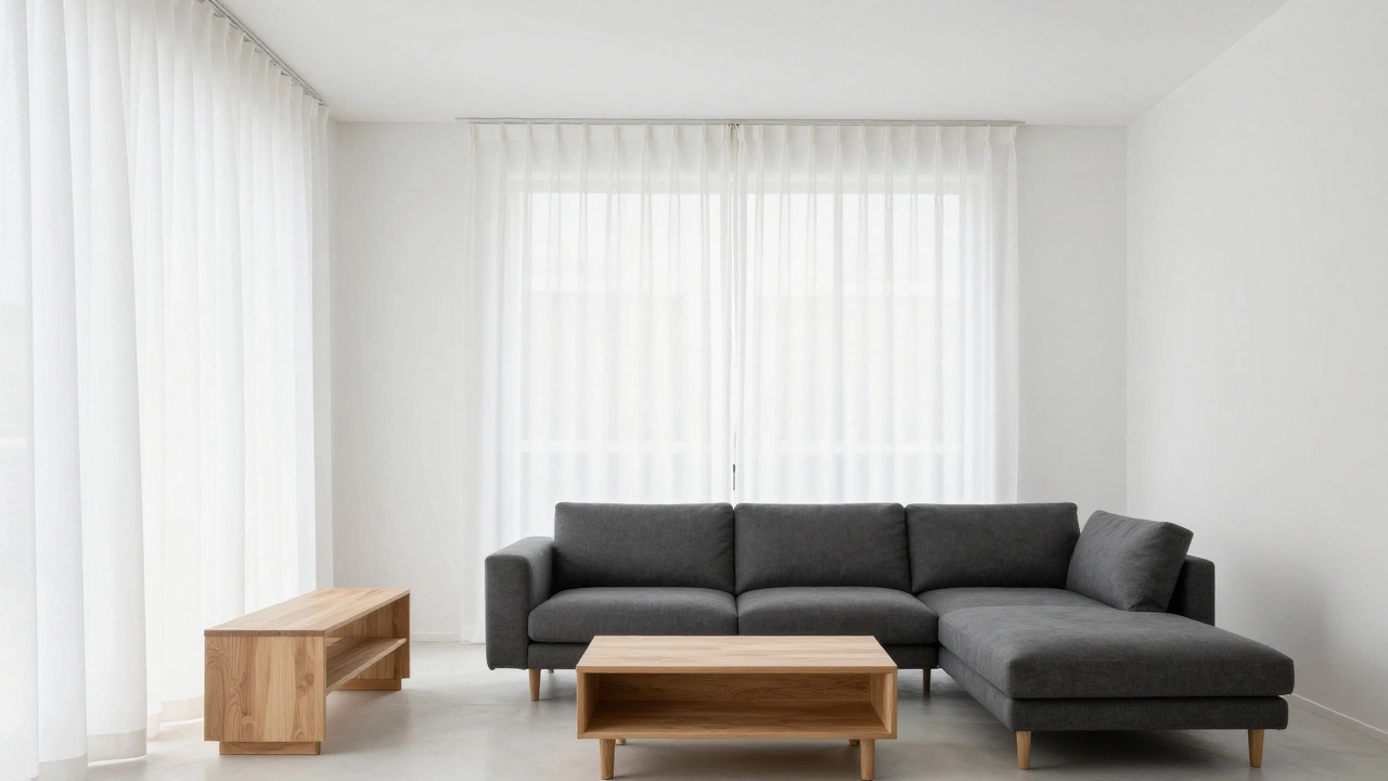
If you’re torn between light and dark, consider matching your curtains to your wall color instead. This is a designer favorite because it makes the windows appear taller and the room feel seamless. By blending the curtains into the background, you push the visual boundaries of the room outward. The furniture then becomes the undisputed star of the show.
This strategy works regardless of whether your furniture is light or dark. For example, if you have white walls and a mix of light and dark wood furniture, white curtains will unify the space. It simplifies the decision-making process and creates a clean, modern aesthetic. Just ensure the fabric has enough weight and texture to stand up visually; flat, thin material might look unfinished against solid-colored walls.
Playing with Texture Over Tone
Sometimes the issue isn’t just about lightness or darkness, but about texture. A room filled with smooth leather sofas and glossy coffee tables can feel cold. Adding curtains with a rougher weave, like linen or bouclé, introduces tactile interest. Conversely, if your furniture is all chunky knit throws and rustic wood, sleek silk or satin curtains can balance the heaviness.
When mixing textures, pay attention to the sheen. Matte fabrics absorb light, making them appear slightly darker, while shiny fabrics reflect light, appearing lighter. A matte charcoal curtain will look different than a satin charcoal one. Use this to your advantage to fine-tune the brightness of your window treatment relative to your furniture.
| Furniture Style | Recommended Curtain Tone | Best Fabric Texture |
|---|---|---|
| Modern Minimalist | Lighter or Matching Walls | Smooth Linen or Cotton |
| Traditional/Classic | Darker than Furniture | Velvet or Silk Blend |
| Scandinavian | Lighter (Whites/Creams) | Sheer or Lightweight Cotton |
| Industrial | Contrasting Dark | Rough Hemp or Canvas |
Consider the Room’s Function
The purpose of the room should dictate your choice. In a bedroom, you likely want darkness for sleep. Here, darker curtains that are deeper than your bed frame or nightstands make sense both functionally and aesthetically. They signal rest and relaxation. In a kitchen or dining area, however, you usually want an open, airy feel. Lighter curtains that complement your cabinetry or table keep the space feeling fresh and inviting for meals and gatherings.
Living rooms are the trickiest because they serve multiple purposes. If your living room is primarily for watching TV, darker curtains reduce glare on the screen. If it’s a social hub for daytime chats, lighter tones keep the atmosphere friendly and welcoming. Think about how you use the space during the day versus at night.
Using Patterns to Bridge the Gap
If solid colors feel too restrictive, patterns offer a middle ground. A patterned curtain contains multiple tones, allowing it to bridge the gap between light and dark furniture. Look for a print that includes both the lightest and darkest colors already present in your room. For instance, if you have a gray sofa and white walls, a curtain with a geometric pattern in gray and white will tie everything together seamlessly.
Scale matters here. Large-scale patterns can overwhelm a small room with delicate furniture, while tiny prints might get lost behind bulky sectional sofas. Aim for a pattern size that complements the proportion of your furniture. This method adds visual interest without committing to a single shade that might clash later when you update other decor elements.
Practical Tips for Testing Your Choice
Before you commit to buying expensive drapes, test the lighting. Colors look different in daylight than under artificial evening light. Bring fabric samples home and hold them up next to your furniture at different times of the day. Notice how the light shifts the tone. A cream curtain might look yellowish in warm evening light, clashing with cool-toned furniture.
Also, consider the hardware. The rod and brackets contribute to the overall look. A sleek black rod pairs well with dark, dramatic curtains, while a brass or gold finish complements lighter, warmer tones. Ensure the rod extends beyond the curtain width to allow the fabric to stack back fully, maximizing light entry when open.
Can curtains be the exact same color as my sofa?
Yes, matching your curtains exactly to your sofa can create a cohesive, monochromatic look. However, to avoid the room looking flat, ensure there is variation in texture. For example, pair a smooth leather sofa with textured linen curtains in the same shade. This adds depth while maintaining color harmony.
What if I have multi-colored furniture?
If your furniture features multiple colors, pick the dominant hue or the neutral base color for your curtains. Alternatively, choose a patterned curtain that incorporates several of the colors found in your upholstery. This ties the disparate elements together without highlighting any single piece too much.
Do darker curtains make a room look smaller?
Not necessarily. While light colors reflect more light, dark curtains can make a room feel cozier and more intimate. If hung floor-to-ceiling, dark drapes can actually elongate the walls, making the ceiling appear higher. The key is balancing the darkness with adequate lighting and lighter accents elsewhere in the room.
How do I choose curtains for a north-facing room?
North-facing rooms receive cooler, indirect light. To counteract this chill, opt for warmer tones in your curtains, such as creams, taupes, or soft yellows, even if your furniture is dark. Avoid stark whites, which can look cold and sterile in low-light conditions. Warm fabrics add comfort and brightness.
Is it okay to mix sheer and blackout curtains?
Absolutely. Layering is a great design strategy. You can use sheer, lighter curtains for daytime privacy and light filtering, paired with heavier, darker blackout curtains for nighttime. This gives you control over the room's ambiance and functionality throughout the day, regardless of your furniture color.