Elegant Curtain Colors: Transform Your Room with Style
 Jan, 2 2025
Choosing curtain colors can be just as important as selecting the right furniture or paint. Colors have the power to alter perceptions and moods, turning an ordinary space into an elegant haven. Curtains, in particular, draw immediate attention in any room by framing windows and setting an overall tone.
Creating an elegant space doesn't necessarily mean sticking to strict rules of decor. Instead, it's all about finding the right balance of colors and textures that reflect your personality while adding that touch of sophistication. Curtains are the perfect opportunity to introduce this subtle elegance.
Embarking on this decorating adventure is easier than one might think once you understand the profound impact curtains can have on your room's ambiance. Dive into the world of color and discover how your curtain choices can elegantly transform your home.
- The Impact of Curtain Colors
- Classic Neutrals for Timeless Elegance
- Rich and Bold Hues for a Statement
- Harmonizing Curtains with Room Decor
The Impact of Curtain Colors
Curtains are not merely functional; they are a vital element of a room's aesthetic that can have a profound psychological effect. Curtain colors hold the ability to influence not just the style and mood of a room but also its perceived temperature and size. The hue you choose sets a certain vibe, playing into the overall atmosphere you wish to create in your home. For instance, lighter tones can make a room feel airy and expansive, while darker shades offer a cozy, intimate vibe. Consider how interior design today often emphasizes personal expression, where choosing the right shades of curtains is crucial in reflecting your unique taste. A room without curtains can often look bare or incomplete, underscoring the importance of selecting the right colors.
Understanding the psychological influence of color is essential. According to color psychology, blue can promote calm and tranquility, making it an excellent choice for bedrooms or spaces meant for relaxation. On the other hand, colors like red and orange can add warmth and energy, perfect for a lively living room or entertaining area. Meanwhile, neutrals such as beige, gray, and white continue to be favorites for creating an elegant and sophisticated look. They offer a blank canvas that easily complements various styles, whether modern, contemporary, or classic. In fact, many decorators emphasize the power of neutrals as they not only adapt to trends but also provide a timeless quality that rejuvenates any room effortlessly.
Another crucial aspect to consider is how colors appear under different lighting conditions. Natural light can enhance the vibrancy of your curtains, while artificial lighting can either mellow them out or give a dramatic effect. This is why interior designers often recommend viewing fabric samples in the intended room during various times of the day. This helps to avoid any tone mismatches or unexpected outcomes once the curtains are up. In an insightful perspective, interior designer Jean Joseph noted,
"Curtains are more than just a color choice; they are an experience that evolves as the light changes, transforming your space throughout the day."Looking deeper into spatial perception, darker colors can give the illusion of reduced space, making large rooms feel more inviting, whereas light-colored curtains can enhance the feeling of space in smaller rooms.
While considering curtain colors, it’s also helpful to think about how they interact with other elements in your room. For example, the hue of your walls, furniture, and even other accessories like cushions or rugs, should ideally harmonize with your curtain selection. Creating a color palette that ties all these elements together can bring cohesiveness and unity to a space, complementing and enhancing each element rather than creating visual chaos. When style syncs with function, it results in a room that's both visually appealing and comfortable to inhabit. In a world flooded with endless home decor inspirations, the transformative potential of curtain colors is both exciting and empowering for homeowners.
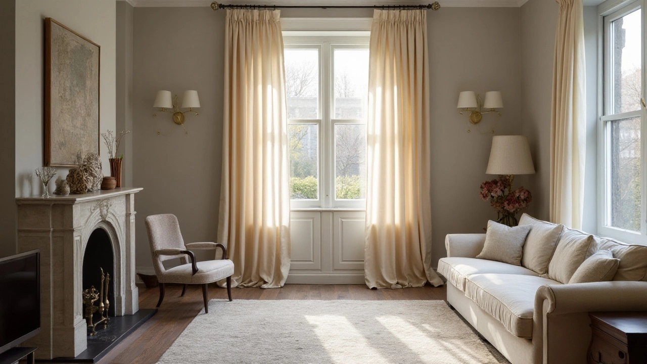
Classic Neutrals for Timeless Elegance
When it comes to creating an elegant atmosphere in any room, neutral curtain colors are often the unsung heroes. Neutrals like beige, taupe, grey, and cream have a subtle beauty that endure fashion trends, offering a timeless aesthetic appeal. Such colors are often chosen for their versatility as they seamlessly blend with various interior styles, from modern minimalist to rustic farmhouse. These colors are not only calming and soothing but also serve as the perfect backdrop for other design elements in a room, like artwork or furniture with bold accents. By opting for neutrals, you allow other features in your room to shine, while maintaining a cohesive look that's both welcoming and refined.
One of the primary advantages of neutral curtains is their ability to make a room feel larger and more open. Light shades reflect more light, creating an illusion of space, which is especially beneficial in smaller rooms or apartments. This effect is complemented by the natural light entering through the windows, which can beautifully illuminate neutral-toned fabric, enhancing the room’s brightness and serenity. Interestingly, a study from the Journal of Color and Design found that rooms with neuteral palettes were perceived to be 25% larger than they actually were when compared to deeply colored ones.
Moreover, neutrals are not just limited to flat, solid colors. Different textures and patterns in neutral tones add depth and interest without overwhelming the space. Linen curtains, for instance, provide a soft, airy look, perfect for a coastal-inspired home, while silk or velvet in these shades can bring a touch of luxury and sophistication. By playing with these textures, one can maintain a monochromatic scheme that is never dull or flat. The flexibility of neutral hues means they can effortlessly complement other colors, whether they're muted or bold, making them ideal for those who frequently like to alter decor elements.
"Neutrals are the safe harbor of interior design. They bring balance in a sea of color, allowing both bold and calm elements to anchor a room," says renowned interior designer Emily Henderson.
Another noteworthy aspect of using curtain colors like neutrals is their ability to adapt to seasonal changes. While other hues may feel too cold in the winter or too warm in the summer, neutrals offer a year-round solution. They provide a canvas that can easily transition from one season to the next with just a few complementary accessories or throw pillows. This adaptability is not just a stylistic benefit but also an economic one, as it reduces the need for frequent changes in decor.
Finally, choosing neutral curtains also affords you the luxury of a 'blank slate'. It's an approach that can easily be personalized to match your taste. Use them to incorporate your favorite colors through small touches like vases, rugs, or even flowers. The elegance, flexibility, and timeless nature of neutrals make them an indispensable choice in the world of home decor. With their enduring charm, they create spaces that resonate with warmth and elegance, ensuring your home remains stylish and inviting for years to come.
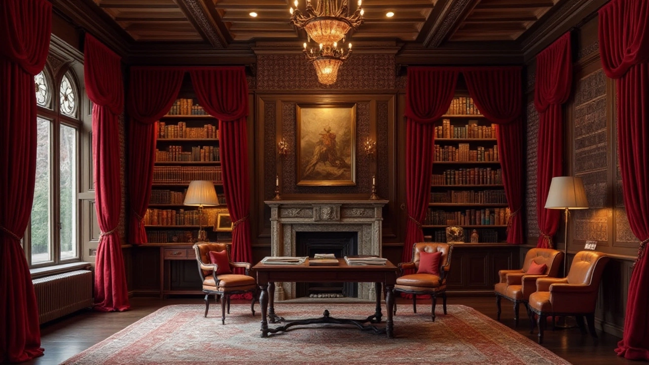
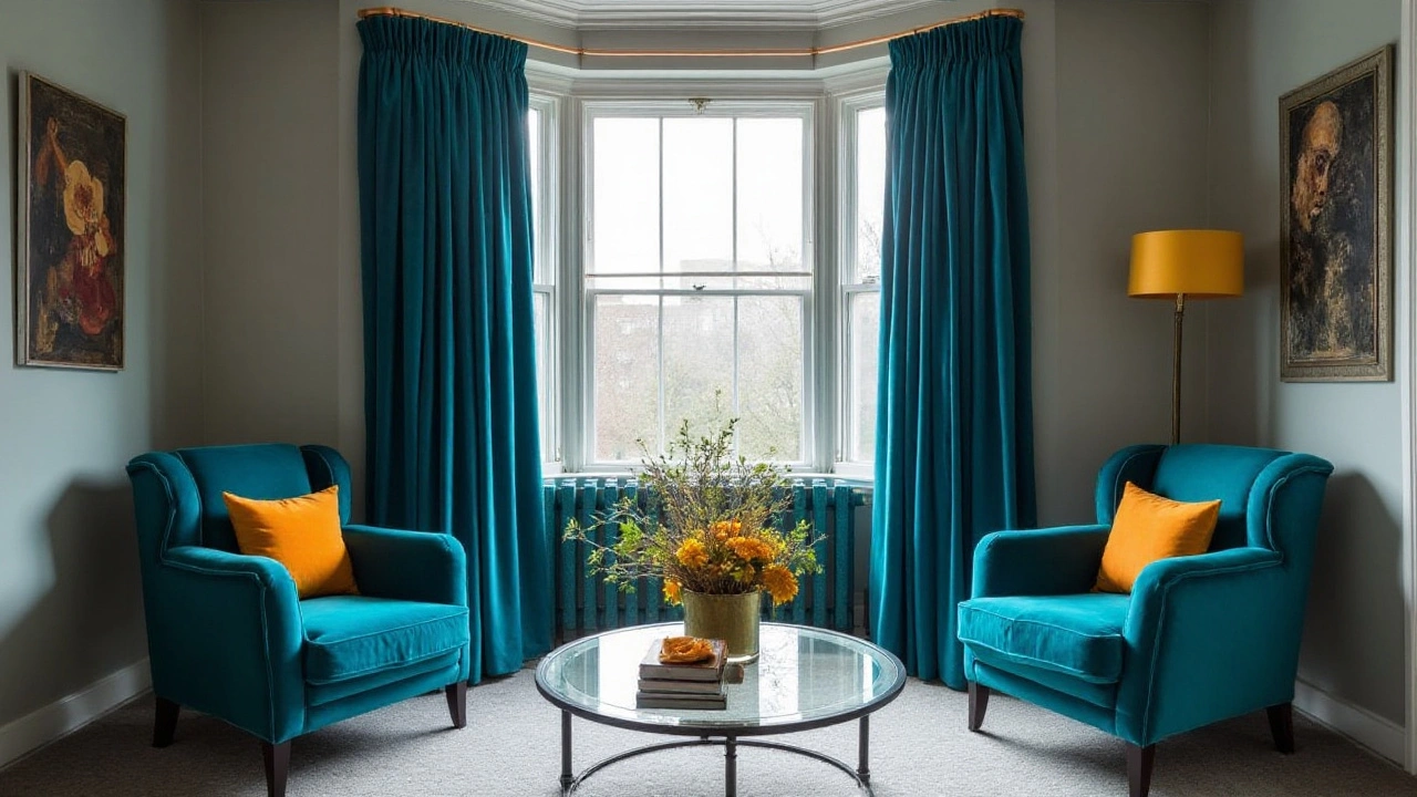
Rich and Bold Hues for a Statement
When it comes to interior design, making a statement can be achieved with the dynamic use of rich and bold colors for your curtains. Bold hues like royal blue, emerald green, and deep burgundy can instantly transform a room into a space of opulence and depth. These colors not only capture attention but also add layers of personality to your home. Consider them the jewelry adorning your windows, reflecting your taste and sensibility.
Choosing the right bold color requires thoughtful consideration of the existing elements in your room. A deep curtain color can beautifully contrast lighter walls, creating an engaging visual impact. Pairing bold curtains with neutral furniture and decor ensures that they stand out and remain the focal point. Not to mention, certain bold hues have historical significance—such as royal blue, which has been associated with luxury and status across various cultures.
Incorporating bold colors doesn't mean your entire palette needs to be fiery and loud. Instead, use bold hues as accent elements, complementing other textures and colors in a cohesive way. "Bold colors when used thoughtfully can elevate a room by adding a touch of drama without overwhelming the senses," advises famed interior designer, Sarah Richardson.
"Balance is key when using vivid colors; they should enhance the room, not dominate it," she suggests.
If you're feeling adventurous, you might explore combining bold curtain colors with patterned designs. Imagine deep forest green with a subtle golden thread woven in, creating a rich tapestry effect. Don't shy away from patterns, as they add an extra dimension to your curtains and can reflect light differently, offering a dynamic element to your space. Patterns and textures can hide minor flaws and also add a tactile quality to your designs.
Temperature is another factor to consider. Warmer hues like deep reds and oranges can give a cozy, inviting feel, perfect for injecting warmth into cooler months. Conversely, cooler tones like sapphire or teal will provide a refreshing contrast during warmer seasons, adding an elegant chill to your room. It’s a misconception that bold means bright—sometimes a bold choice is about depth, not just intensity.
Recent studies highlight how color psychology plays a crucial role in mood and perception. For instance, a study from the University of Texas illustrates that deeper hues often generate feelings of comfort and security. This association with safety could explain why many opt for bold colors in spaces intended for relaxation, such as living rooms or bedrooms.
As you navigate through the myriad of choices available, remember that the right bold color can act as a transformative element in your space, echoing your tastes and providing an elegant, sophisticated backdrop that invites and intrigues. Start small if you're hesitant—perhaps an accessory or two before committing to larger swathes of color with your curtains. Embrace your courage for boldness and watch as your room transforms into an elegant masterpiece.
Harmonizing Curtains with Room Decor
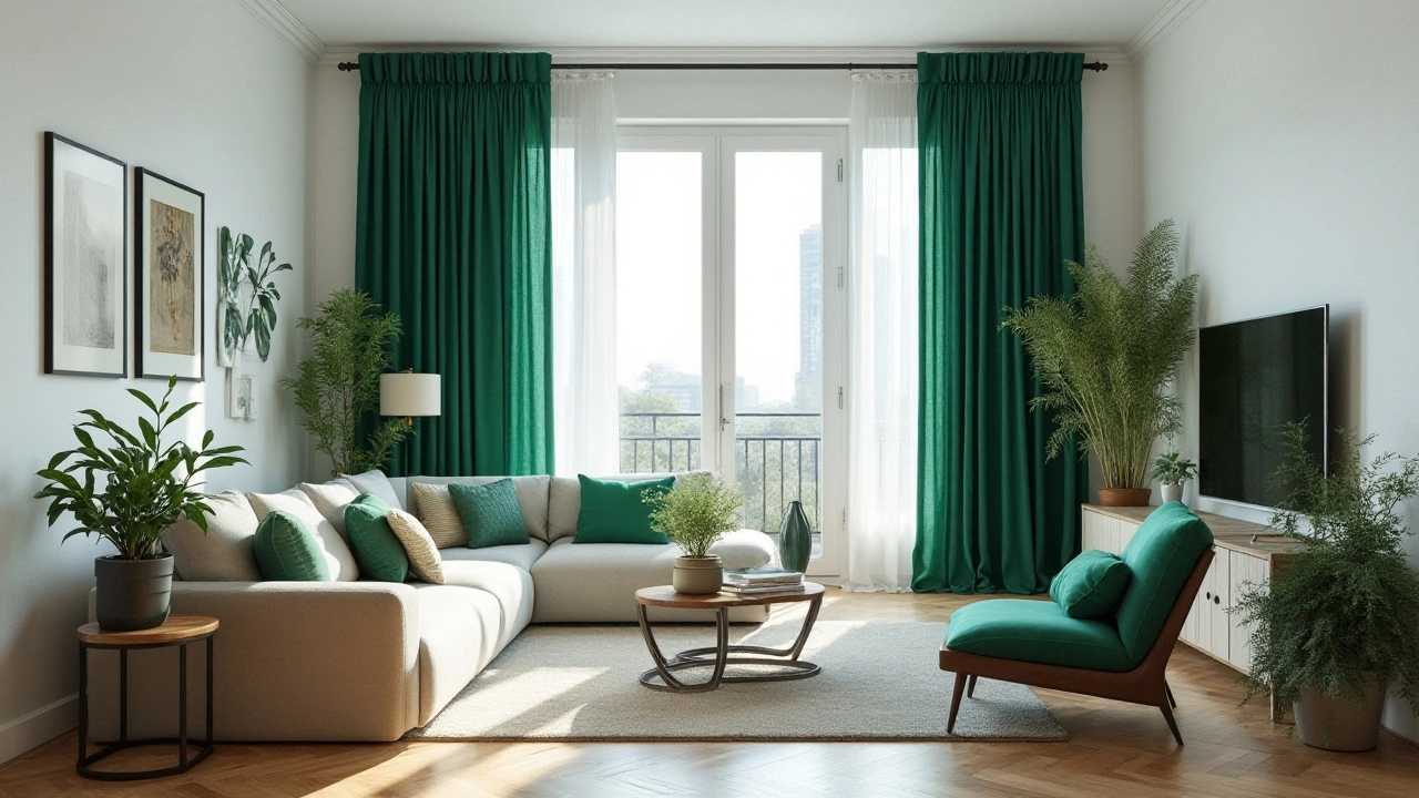
When it comes to achieving an elegant look in your home, harmonizing curtain colors with your room decor creates a cohesive and stylish ambiance. This process requires an eye for detail and a willingness to experiment with hues and textures. The right choice of curtains can dictate the atmosphere of a room, complementing the furniture, wall colors, and accent pieces. A common starting point is aligning curtain colors with a dominant color in your room's palette to ensure a seamless transition. If your space is dominated by neutral tones, consider curtains that either match for a calming effect or contrast for a more dynamic look.
One effective technique is to pick up an accent color from existing décor elements like a rug, cushions, or artwork. This method can tie a room together, as colors on walls and in furniture are echoed by the curtains without feeling overpowering. If you're starting from scratch, designing the room with a clear color scheme in mind provides a roadmap for selecting curtains. Remember, colors can affect perceptions of temperature and space; cooler shades make a room feel larger and more expansive, while warmer tones add coziness and intimacy. Great color combinations can make your room feel elegant and well-composed.
Considering textures alongside colors adds another layer of depth to the harmonization process. Heavy draperies in sumptuous fabrics like velvet or silk offer sophistication, but these might overwhelm a space with lighter, minimalist furnishings. Conversely, sheer fabrics provide an airy feel that's ideal for contemporary settings. Texture and fabric choice should resonate with the room's style to achieve true harmony. This might require trial and adjustments, but the efforts pay off when your living room turns into your favorite place to relax.
Interior design trends suggest that monochromatic themes continue to charm many decorators, advocating for varying shades of a single color to enrich a room's layout. Layering plain tones with dramatic accents—even within the same color family—can craft an elegant, cohesive space. If bold colors appeal to you, consider pairing them with elegant curtain colors that lean towards rich, sophisticated hues. Master decorators often recommend playing with hues slightly darker or lighter than the dominant wall color for curtains, offering depth and maturity without clashing.
"The key to a room that exudes elegance is balance, not perfection." - Mary McDonald, Acclaimed Interior Designer
For more adventurous designers, mixing patterns with solid colors introduces personality and charm. When treading this route, one golden rule is to choose a unifying color to anchor the different patterns together. Curtains with subtle patterns can mirror the wall treatments or upholstery, assisting in the unification of your overall theme. An important aspect to consider when harmonizing your curtain colors with room decor is the room's purpose. A restful bedroom may benefit from soothing, gentle hues, while an office or creative space might thrive with vibrant, energetic tones. By tailoring your approach to the function of each room, you enhance its use while maintaining the thread of elegance throughout your home.
The sophistication of a room is not solely dictated by the luxuries within but also by the thoughtful integration of each element. Harmonizing curtains with decor invites continuity in design, which speaks to refined tastes and considered choices. With intentional pairing of colors, in conjunction with an awareness of lighting and dimensions, curtains transform from a mere accessory to an essential feature that captures both heart and home.