What Bathroom Color Is Timeless? The Ultimate Guide to Enduring Palettes
 Jul, 6 2026
Timeless Bathroom Palette Builder
Select a base wall color to see recommended fixtures, materials, and lighting for a timeless look.
Select a color above
Discover the perfect combination of fixtures, materials, and lighting to create an enduring design.
Recommended Pairings
You spend a lot of time picking out the perfect vanity mirror or the right towel bars. But what about the walls? What about the floor? If you choose a color that screams "2024 trend," you might be staring at a dated space by next summer. We’ve all seen it: those bright teal tiles or the neon yellow accents that felt fresh for six months and now feel like a mistake. You want a bathroom that feels calm, clean, and sophisticated for years, not just until the next big Pinterest board drops.
So, what bathroom color is timeless? It isn’t one single shade. It’s a strategy. It’s about choosing hues that mimic nature, materials that age gracefully, and palettes that let your accessories do the talking. In this guide, we’ll break down exactly which colors stand the test of time, why they work, and how to use them without making your space look boring.
The Power of Neutrals: Why White Isn’t Boring
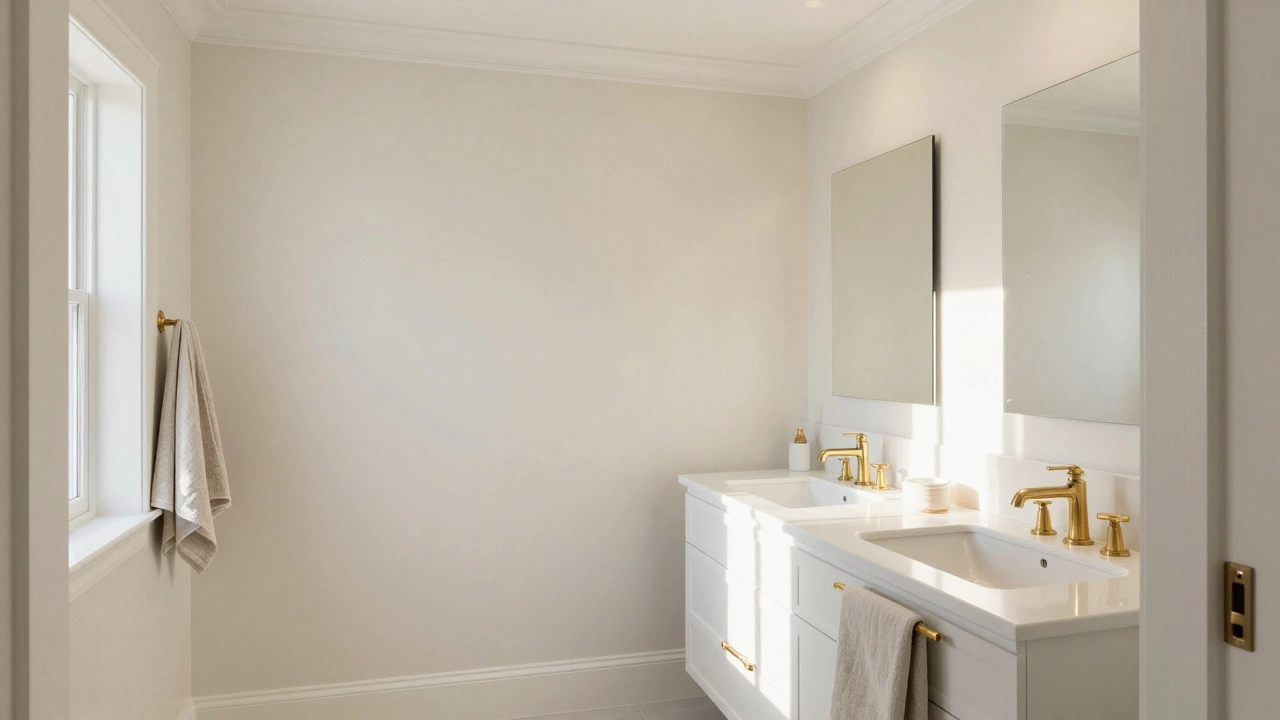
When people hear "neutral," they think beige. When they think "boring," they think flat white. But true timeless design uses neutrals as a canvas, not a constraint. White, in particular, is the undisputed king of timeless bathroom colors. It reflects light, makes small spaces feel larger, and pairs with literally any material-wood, marble, brass, chrome, matte black.
But here’s the trick: don’t go for sterile, hospital-style white. Look for whites with a slight undertone. A warm white (with hints of yellow or cream) feels cozy and inviting. A cool white (with hints of blue or gray) feels crisp and modern. Both are timeless if applied correctly. The key is consistency. Match your trim, your ceiling, and your major wall surfaces to create a seamless flow. This creates a sense of spaciousness that never goes out of style.
Consider the role of lighting. North-facing bathrooms benefit from warmer whites to counteract the cool natural light. South-facing bathrooms can handle cooler whites because the sunlight adds warmth naturally. Getting this balance right means your bathroom will always feel comfortable, regardless of the time of day.
Greige: The Best of Both Worlds
If pure white feels too stark, turn to Greige. This hybrid of gray and beige has dominated interior design for over a decade and shows no signs of fading. Why? Because it bridges the gap between traditional warmth and modern coolness. It’s forgiving. It hides dust better than white but doesn’t absorb heat like dark colors. It works with both wood tones and stone finishes.
Greige is particularly effective in bathrooms because it mimics the natural tones of sandstone, limestone, and driftwood. These are materials that have existed for millennia, so their color counterparts naturally feel permanent. When you paint your walls a soft greige, you’re essentially creating a backdrop that says, "I belong here." It’s subtle, yes, but subtlety is the hallmark of timelessness.
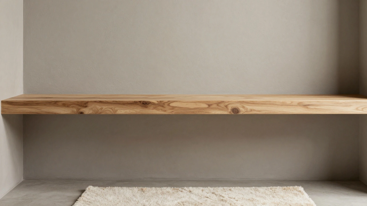
To make greige work, vary the textures. Use a smooth matte paint on the walls, pair it with rough-hewn wood shelves, and add a plush cotton bath mat. The contrast keeps the eye engaged without needing bold colors. This approach ensures that even if your taste changes, the foundation remains solid.
Navy Blue: The Classic Accent
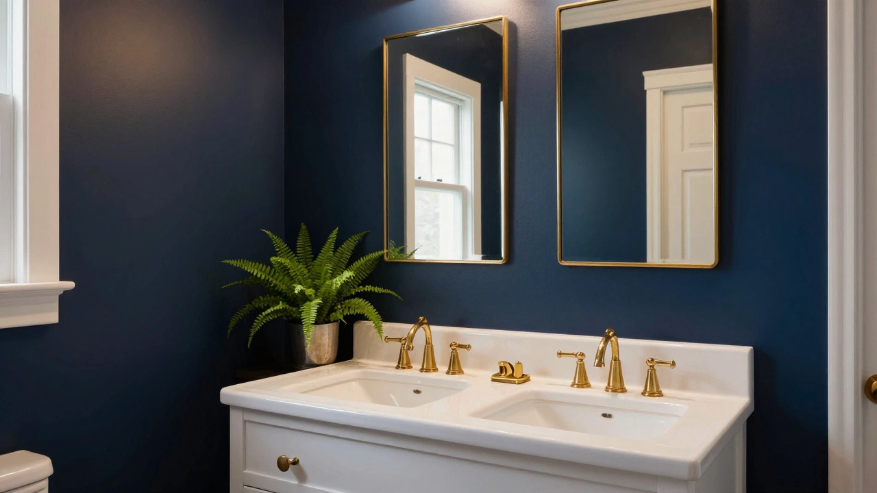
Neutrals are great for walls, but what about adding depth? Enter Navy Blue. Unlike trendy pastels or aggressive brights, navy blue has been a staple in nautical and traditional design for centuries. It feels grounded, luxurious, and incredibly versatile. A navy blue feature wall, especially behind the vanity, adds drama without overwhelming the space.
Navy works beautifully with white fixtures and brass hardware. Think of it as the tuxedo of bathroom colors-it’s formal, elegant, and always appropriate. It also hides water spots and soap scum better than lighter shades, which is a practical bonus. However, use it sparingly. One accent wall or even just the lower half of the room (wainscoting style) is enough to make a statement without closing off the space.
If you’re worried about committing to full walls, try navy on your bathroom cabinet doors or inside open shelving. This allows you to enjoy the richness of the color while keeping the overall feel light and airy. It’s a low-risk way to incorporate a timeless hue into your decor.
Sage Green: Nature’s Calm
In recent years, Sage Green has emerged as a powerful contender for timeless status. While it may feel new to some, muted greens have been used in interiors since the Victorian era. They connect us to nature, promoting relaxation and tranquility-exactly what a bathroom should be. Sage green is soft, dusty, and unobtrusive. It pairs wonderfully with white, wood, and even black fixtures.
This color is especially effective in smaller bathrooms because it recedes visually, making the space feel more open. It also complements plants beautifully. Adding a few potted ferns or pothos vines against sage green walls creates a spa-like atmosphere that feels both current and classic. The key is to avoid anything too vibrant or lime-like. Stick to desaturated, earthy tones that resemble moss or dried leaves.
Sage green is also highly adaptable. In a morning sun, it looks fresh and energetic. In the evening, under warm artificial light, it becomes soothing and dim. This dual personality makes it a smart choice for multi-use bathrooms where both functionality and relaxation are important.
Material Matters: Beyond Paint
Color isn’t just about paint. It’s about the materials you bring into the room. Natural Stone like marble, travertine, and slate come in inherent neutral tones that are inherently timeless. Marble veining adds visual interest without requiring a specific color trend. Wood elements, whether in flooring, vanities, or accessories, bring warmth and organic texture that synthetic materials can’t replicate.
When selecting tiles, opt for large-format options in neutral grays, creams, or whites. Smaller tiles with intricate patterns can date quickly. Large tiles create a clean, minimalist look that aligns with modern sensibilities while remaining rooted in classical simplicity. Grout color matters too. Matching grout to the tile color creates a seamless look, while contrasting grout adds definition. For a timeless finish, match the grout.
Mirrors and lighting fixtures also influence perceived color. Mirrors reflect light and expand the sense of space, enhancing the brightness of neutral walls. Lighting temperature plays a crucial role. Warm white bulbs (2700K-3000K) enhance the coziness of beige and sage, while cool white bulbs (4000K+) sharpen the clarity of white and navy. Choose lighting that complements your chosen palette.
How to Test Colors Before Committing
Before you buy gallons of paint, test your choices. Buy small samples of your top three contenders. Paint them directly onto the wall, not on cardboard or paper, which can distort the true color. Observe them at different times of day. Morning light reveals cool undertones; afternoon light highlights warmth; evening artificial light shows saturation levels.
Live with the samples for at least three days. See how they interact with your existing fixtures, towels, and furniture. Does the white clash with your porcelain toilet? Does the greige wash out your wooden shelf? Real-world testing prevents costly mistakes. Remember, screens lie. Digital representations of colors rarely match the physical reality due to monitor calibration and lighting differences.
| Color | Best For | Pairs Well With | Avoid With |
|---|---|---|---|
| Warm White | Small spaces, north-facing rooms | Wood, brass, cream textiles | Cool gray metals |
| Cool White | Modern aesthetics, south-facing rooms | Chrome, glass, black fixtures | Heavy wood tones |
| Greige | Transitional styles, medium-sized rooms | Limestone, linen, brushed nickel | Bright primary colors |
| Navy Blue | Accent walls, powder rooms | White, gold, marble | Dark woods, cluttered spaces |
| Sage Green | Spa-like vibes, plant-heavy decor | White, rattan, ceramic | Harsh fluorescent lighting |
Common Mistakes to Avoid
One of the biggest errors homeowners make is following trends blindly. Just because a color is popular on social media doesn’t mean it will last five years. Trends cycle rapidly; classics endure. Another mistake is ignoring the room’s function. A bathroom is a wet environment. Dark colors can show water stains more prominently if not sealed properly. Light colors require frequent cleaning to maintain their freshness.
Also, don’t forget the ceiling. Painting the ceiling the same color as the walls can make a low-ceilinged bathroom feel taller. Leaving it stark white when walls are colored can create a disjointed look. Consistency is key. Finally, resist the urge to mix too many colors. Stick to a base neutral and one or two accents. Too much variety creates visual noise, which ages poorly.
Is beige still considered a timeless bathroom color?
Yes, but with caveats. Traditional beige can look dated if it’s too yellow or orange. Opt for greige or taupe, which blend gray and beige for a more modern, sophisticated look. These shades retain the warmth of beige while feeling cleaner and more contemporary.
Can I use black in a timeless bathroom design?
Black is best used as an accent rather than a dominant wall color. Black fixtures, mirrors, or showerheads add contrast and definition. Using black on walls can make a small bathroom feel cramped and gloomy unless you have excellent lighting and ventilation. Stick to neutrals for walls and use black for details.
What is the most versatile bathroom color scheme?
The most versatile scheme is white walls with natural wood accents and metal fixtures in either brass or chrome. This combination allows you to change towels, rugs, and small accessories easily without repainting. It adapts to seasonal changes and personal style shifts effortlessly.
Does lighting affect how bathroom colors look?
Absolutely. Natural light changes throughout the day, altering color perception. Artificial lighting also plays a huge role. Warm bulbs enhance yellows and reds, while cool bulbs emphasize blues and grays. Always test paint samples under the actual lighting conditions of your bathroom before finalizing your choice.
Are pastel colors ever timeless?
Pastels like mint green or baby blue can feel nostalgic but often date quickly. They are associated with specific eras (like the 1950s or 1980s). For a timeless look, stick to muted, desaturated versions of these colors if you must use them, but neutrals remain safer and more enduring choices.