Best Neutral Curtain Colors That Match Any Room Decor
 Apr, 16 2026
Neutral Curtain Color Finder
Visual Recommendation
Quick Tip: Hold your final choice against a white piece of paper in natural light to confirm the undertone.
Neutral curtain colors are the unsung heroes of interior design because they don't compete with your existing furniture. Whether you have a bold navy velvet sofa or a minimalist white bedroom, the right neutral shade blends in and lets your other decor shine. But "neutral" isn't just one color-it's a spectrum ranging from crisp whites to deep charcoals.
Key Takeaways for Versatile Window Treatments
- Off-white and cream are the safest bets for brightening dark rooms.
- Light gray is the most modern versatile option for cool-toned spaces.
- Beige and oatmeal work best in cozy, warm-toned environments.
- Charcoal and navy act as "anchor" neutrals for high-contrast looks.
- Texture often matters more than the exact shade when choosing a neutral.
The Power of White and Off-White
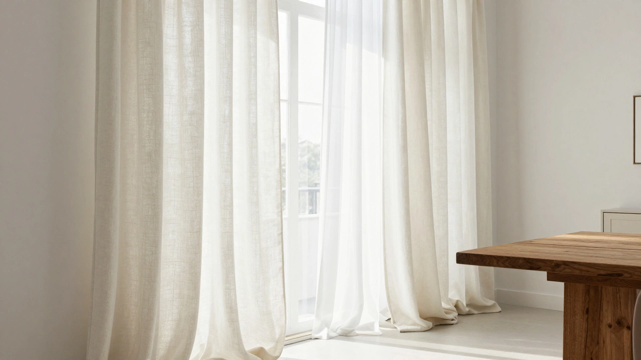
If you're truly undecided, start with white. White curtains are light-colored fabric window coverings that maximize natural light and create a clean, airy aesthetic. They are the ultimate blank canvas. However, a stark, bleached white can sometimes feel like a hospital ward or a hotel room. To fix this, look for off-white or cream tones.
Off-whites have a tiny hint of yellow or brown, which softens the look. They pair beautifully with everything from a rustic wooden dining table to a sleek glass coffee table. If your room has a lot of natural sunlight, white curtains will reflect that light, making a small apartment feel significantly larger. Just keep in mind that pure white linen can be a magnet for dust and pet hair, so consider a blend if you have a golden retriever roaming the house.
Gray: The Modern Chameleon
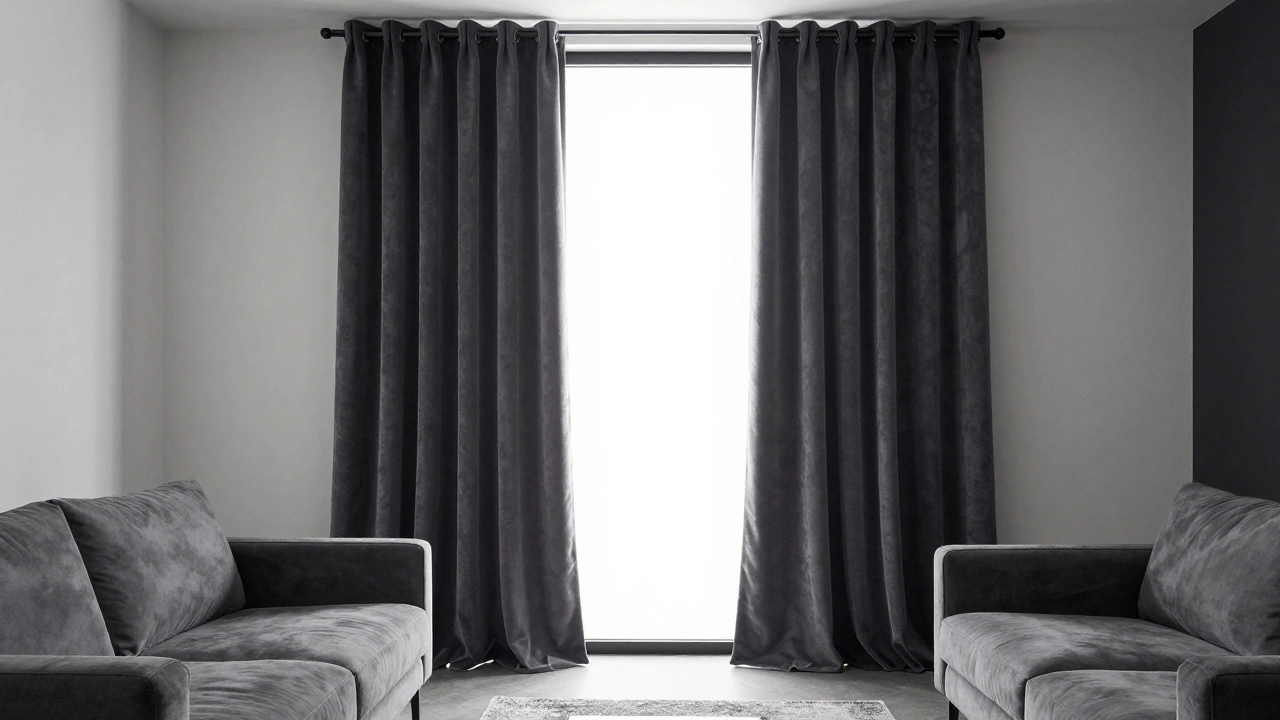
For the last decade, gray has dominated home design because it bridges the gap between warm and cool tones. Gray curtains are neutral window treatments that range from pale silver to deep slate, offering a sophisticated and contemporary feel.
Light gray is particularly effective because it doesn't feel as "heavy" as dark colors but provides more contrast than white. It works perfectly with blue, green, pink, and yellow. If you have a gray sofa-which is incredibly common-matching your curtains to that shade creates a cohesive, streamlined look. If you want something more dramatic, a charcoal gray provides a "frame" for the window, drawing the eye outward to the view and making the interior feel more grounded.
| Color | Best For | Vibe | Maintenance |
|---|---|---|---|
| Cream/Off-White | Dark rooms, traditional styles | Warm, airy, classic | High (shows stains) |
| Light Gray | Modern apartments, cool tones | Clean, professional, sleek | Low (hides dust) |
| Beige/Oatmeal | Earth tones, boho styles | Cozy, organic, grounded | Medium |
| Charcoal | Large rooms, high contrast | Moody, elegant, bold | Low |
Beige and Oatmeal for Organic Warmth
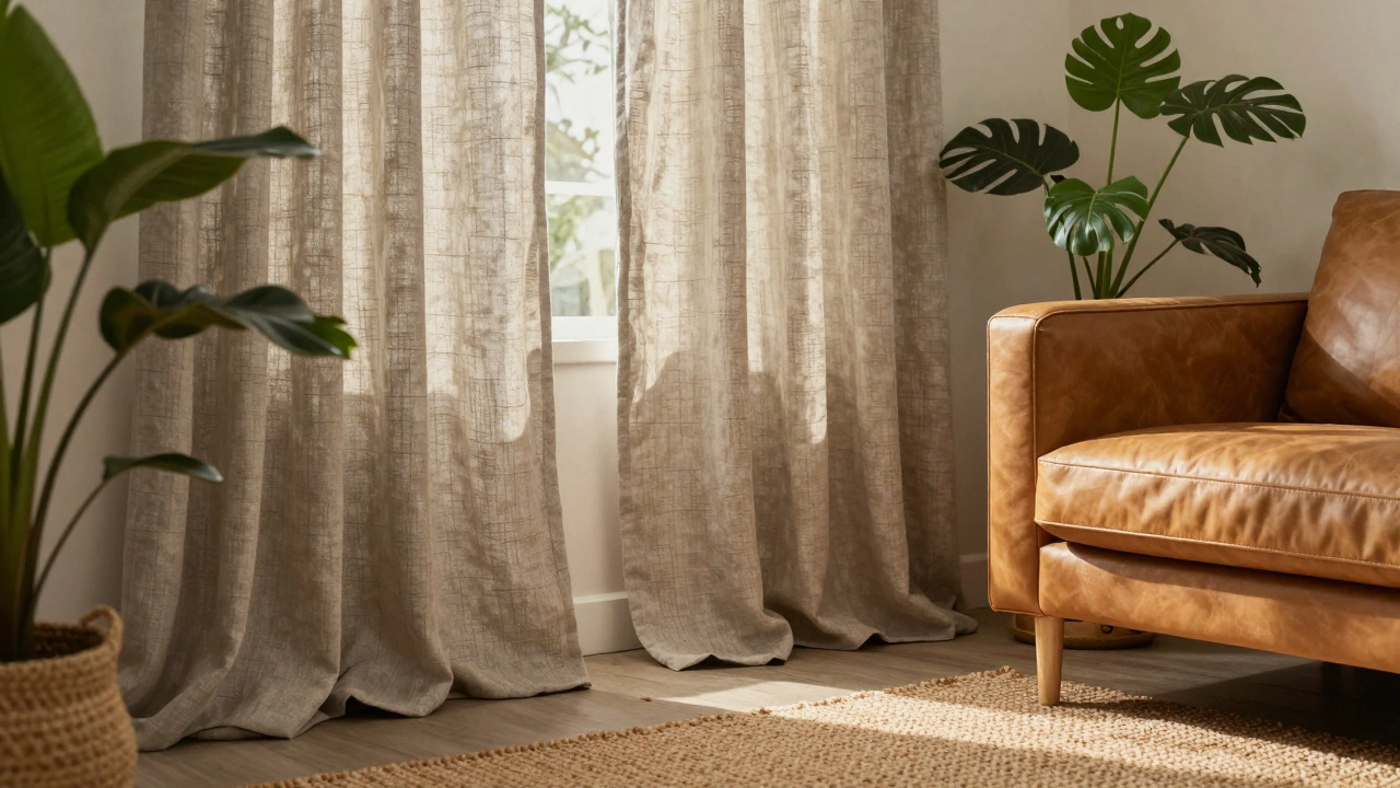
If your home features a lot of wood, leather, or plants, gray might feel too cold. This is where Beige (and its cousins like oatmeal and sand) comes in. These are warm neutrals that make a room feel inviting. Unlike white, which can feel sterile, beige adds a layer of comfort.
Think about a living room with a tan leather couch and a jute rug. Beige curtains tie those elements together without adding a new, clashing color to the mix. The key here is to avoid "yellow-beige," which can look dated (think 1990s office building). Instead, go for "greige"-a mix of gray and beige. It’s the gold standard for modern versatility because it adapts to whatever light is hitting it throughout the day.
The Role of Texture in Neutral Choices
When the color is simple, the fabric does the talking. A flat, polyester beige curtain looks cheap, but a heavy Linen curtain in the same color looks like something from a luxury boutique. The texture prevents a neutral room from looking flat or boring.
Consider these options based on your goals:
- Sheer fabrics: Best for letting light in while maintaining privacy. These almost always look best in white or cream.
- Velvet: Adds weight and luxury. A gray or navy velvet curtain can make a room feel like a high-end hotel.
- Linen blends: The most versatile choice for a "lived-in" look. They have a natural weave that adds visual interest.
Avoiding Common Neutral Mistakes
Even with a "safe" color, things can go wrong. The biggest mistake is ignoring the undertone. Every neutral has a base color. A "gray" curtain might actually have a blue undertone or a green undertone. If your walls are a warm cream and your curtains are a cool blue-gray, they will clash, and the curtains will end up looking slightly purple or muddy.
Another pitfall is the "beige-out." When every single thing in the room-walls, sofa, rug, and curtains-is the exact same shade of beige, the room loses its dimension and starts to look like a cardboard box. To avoid this, use the 60-30-10 rule: 60% dominant color (walls/rug), 30% secondary color (curtains/upholstery), and 10% accent color (pillows/art). If your curtains are neutral, use your accent pieces to add a pop of color.
How to Match Curtains to Your Walls
You have two main paths here: blending in or standing out. To make a room feel larger, choose curtains that are a shade or two lighter or darker than your wall color. This creates a subtle, sophisticated gradient. If you have white walls, choosing off-white curtains creates a seamless look that makes the ceiling feel higher.
If you want the windows to be a focal point, go for contrast. Pair a light gray wall with charcoal curtains, or a dark navy wall with crisp white drapes. This creates a "frame" effect that highlights the architecture of the room. Just remember that the darker the curtain, the more it will absorb light, which can make a room feel smaller if the space is already cramped.
Do white curtains make a room look smaller?
Actually, the opposite is true. White curtains reflect more light, which tricks the eye into thinking the space is more open and airy. This is why interior designers almost always suggest white or light cream for small apartments or rooms with limited natural light.
What is the difference between beige and greige?
Beige is a warm neutral with yellow or brown undertones. Greige is a hybrid of gray and beige. It is designed to be the "perfect" neutral because it works with both cool colors (like blue) and warm colors (like orange or gold) without clashing.
Can I use dark colors like navy or charcoal as neutrals?
Yes, in the design world, navy, charcoal, and black are often treated as "anchor neutrals." They provide a strong contrast and work with almost any other color, though they aren't as "invisible" as white or beige. They are great for bedrooms where you want a cozier, darker atmosphere.
Which fabric is most versatile for neutral curtains?
Linen or linen-blends are generally the most versatile. They have a natural, organic texture that fits both modern and traditional styles. They also drape beautifully, which prevents neutral colors from looking too flat or boring.
How do I tell if my neutral curtains have a cool or warm undertone?
The best way is to hold the fabric against a piece of pure white printer paper in natural daylight. If the fabric looks slightly yellow or pink, it's warm. If it looks slightly blue or green, it's cool. Matching these undertones to your wall paint is the secret to a professional-looking room.
Next Steps for Your Home Makeover
Now that you know which colors work with everything, start by auditing your room. Look at the biggest pieces of furniture you own-your sofa and your rug. If those items have warm tones, go for cream or beige. If they have cool tones, stick with gray or white.
If you're still nervous, buy fabric swatches first. Hold them up against your walls at different times of the day. A color that looks like a perfect sand-beige at noon might look like a dull mustard yellow at 6 PM under artificial light. Once you've confirmed the undertone, choose a textured fabric like linen to ensure the room feels expensive and layered rather than flat.